So this is it, people – THE final post in the series that seemed to drag on FOR-EVVVVV-ERRRRR.
I wanted to post this a month ago but honestly, I procrastinated taking the photos because it’s really difficult photographing this tiny space and I just wasn’t feelin’ it. The powder bath is right off a small hallway to the laundry room and doesn’t get any natural light at all.
I should have taken a video of me taking the photos because you would crack up – I basically looked like a contortionist auditioning to be in the latest Cirque du Soleil production. Have fun with that imagery …
Anyway, if you’re new here or new to this series (Welcome!), you can get caught up on Parts 1 through 5 here, here, here, here, and here.
So in Part 5, I discussed the artwork I was looking to hang in this cute little space and mocked up a few options in Photoshop to help me decide which piece I wanted to order. I ended up purchasing Option D on Etsy and I couldn’t be happier!
THE ARTWORK
I requested the Etsy seller to ship the 18×24 canvas to me unstretched so I could have it framed like a regular picture which was totally the right move.
I couldn’t get over how much it looked like an actual painting – absolutely gorgeous – and it was only $49. Deal of the century right there.
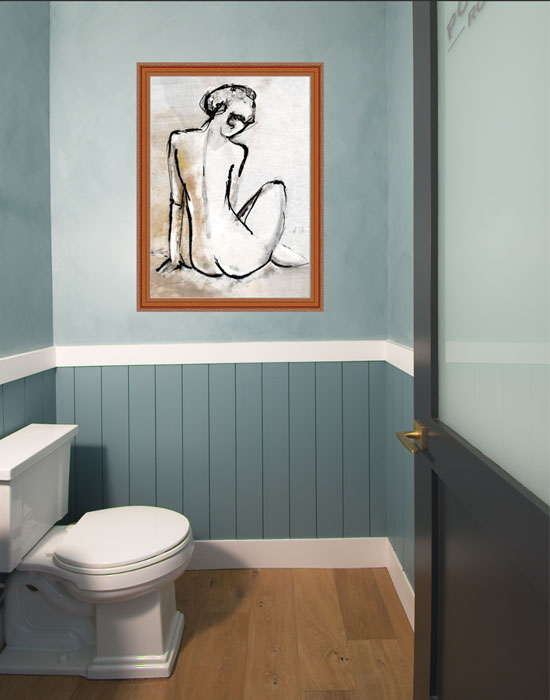
Option D 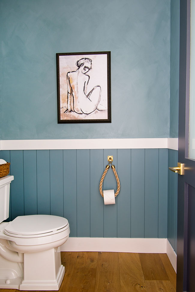
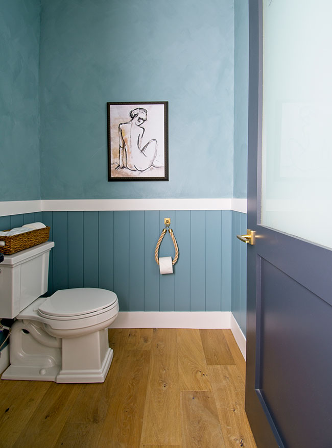
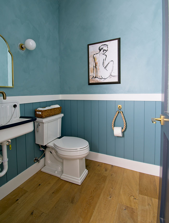
The actual framed piece
A wonderful friend of mine, Kelly, owns a frame and art gallery here in Naples and I was over the moon when she told me to come and pick up my newly-framed art. Kelly convinced me to go with a frame I never would have picked on my own – a black traditional frame that has a modern twist due to its slim profile. The frame also has a subtle gold-leaf finish on it and OMG – it’s STUNNING in person.
I should have purchased the 24×32 size since it turned out a little smaller than I envisioned (I originally planned on getting a wider frame), but I figured I would surround it with vintage art to fill out the wall a bit more. However, now that we’re going to be moving in the next few months, I’m just going to leave it as-is.
THE LITTLE DETAILS
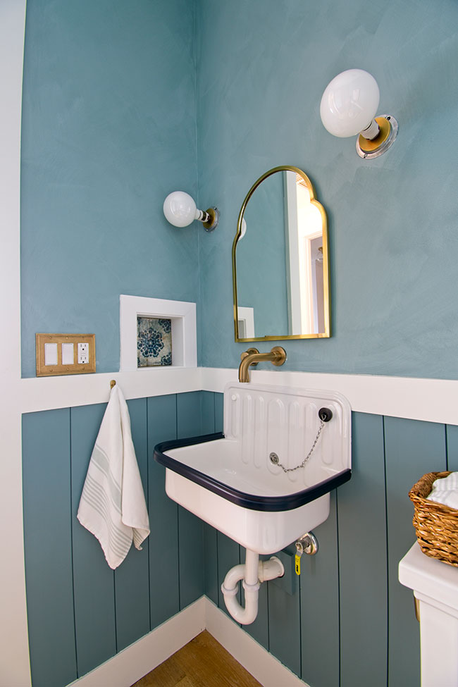
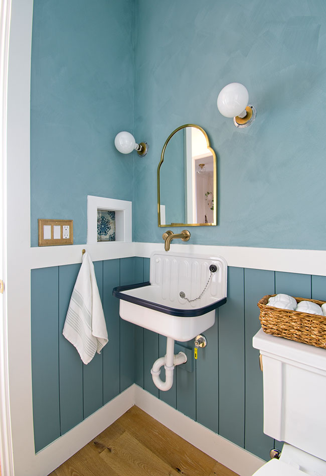
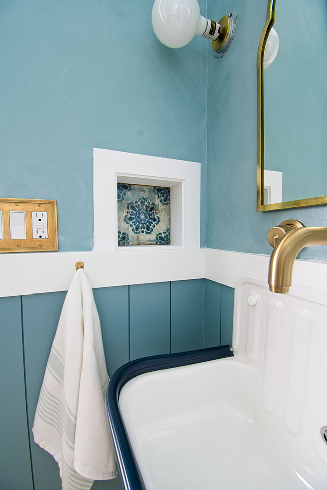
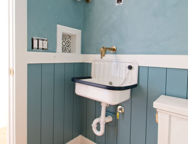
I found this gorgeous vintage-inspired ceramic tile online at Home Depot and bought a sample for $5 to replace the cement tile in the little soap dispenser niche in the wall.
What a difference a $5 piece of ceramic tile made to add some more old-world charm to this tiny space!
And the kicker is, I bought this tile AFTER I already painted the room and the tile matches the Benjamin Moore Aegean Teal paint (at 75% strength) I used EXACTLY! I mean, what the hell were the chances of THAT actually happening?
I love this tile so much now, I’m trying to figure out where to use it on our new fixer-upper. I can’t express just how beautiful it is in person – it’s a little work of art!
The next little detail I focused on was changing out the basic white plastic light switch cover with this satin brass switch plate from Home Depot.
The brass was a bit too bright for the old-world look I was going for, so I instantly antiqued it by using Rub n’ Buff in Antiqued Gold.
If you haven’t used this product yet, it’s a must-have in your DIY arsenal, and trust me – you WILL get addicted to using it. Don’t say I didn’t warn you …
THE FINAL REVEAL PHOTOS
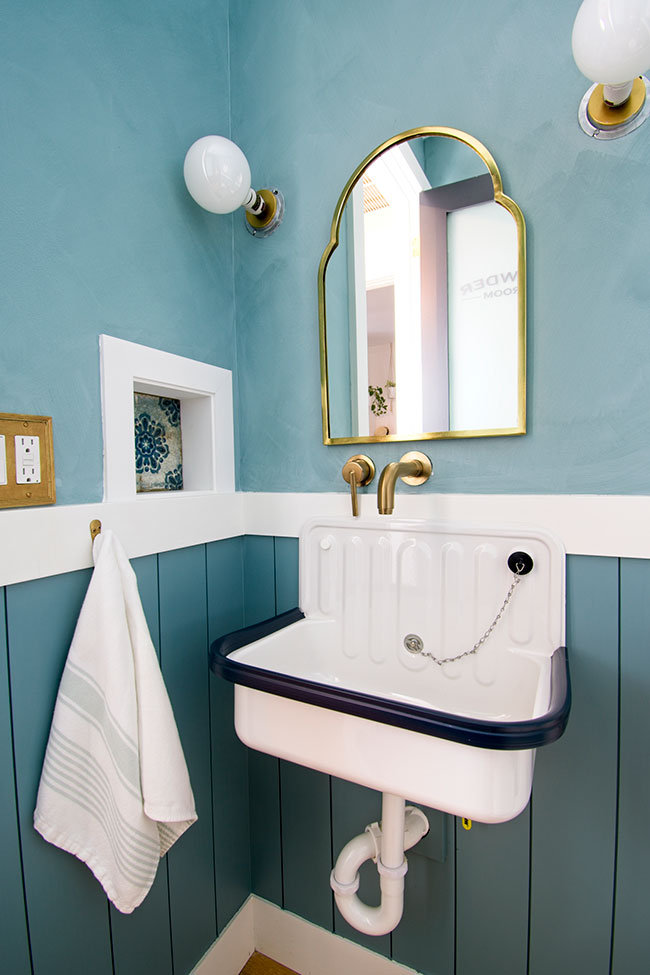
Alright alright alright … let’s get on to the photos I painstakingly turned myself into origami to take to share with you today. Enjoy!
THE DESIGN SOURCES
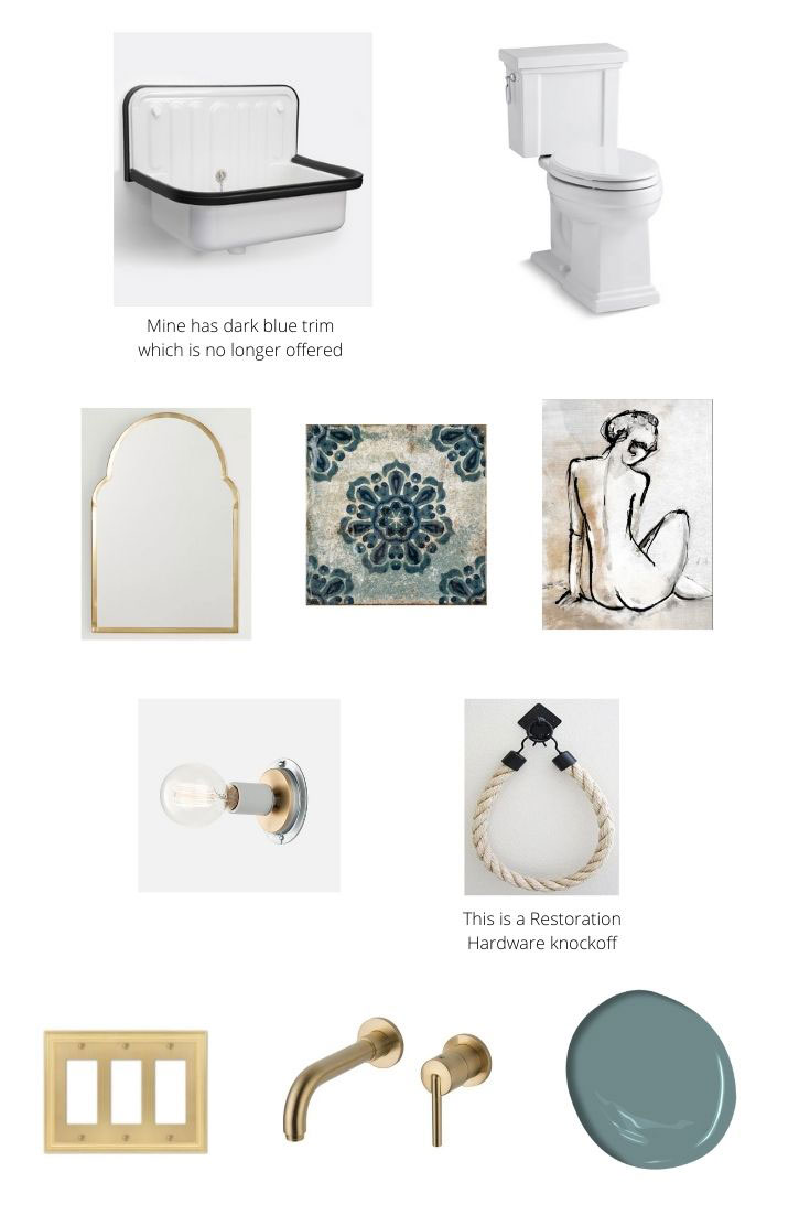
SINK | TOILET | MIRROR | TILE | ART
SCONCES | ROPE (FOR TOILET PAPER)
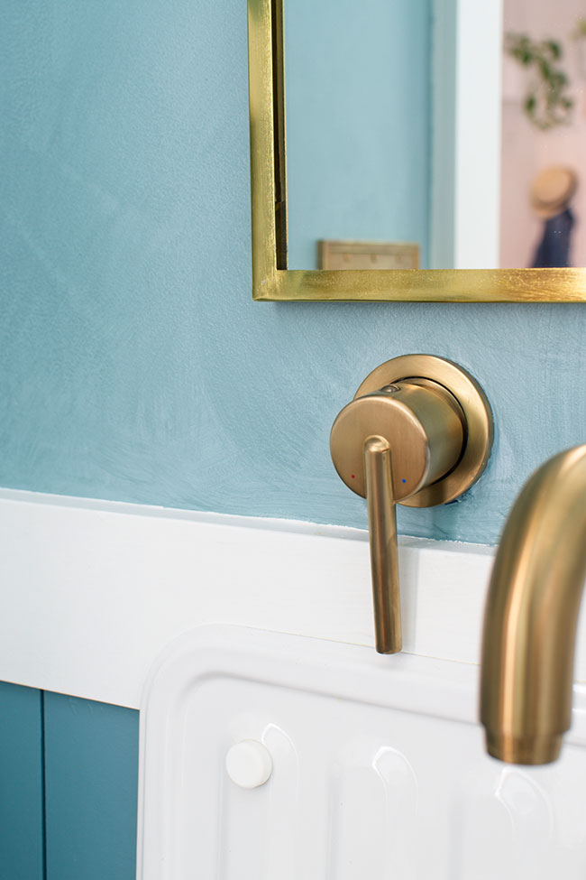
WALL PLATE | SINK FAUCET | PAINT
If you enjoyed reading this article, make sure to sign up for the weekly newsletter below so you never miss a post.
Thank you so much for following my blog and allowing me to inspire you in creating your own lived-in, loved-in spaces!


