Welcome to this edition of “Color Me Happy – How to Create Your Home’s Perfect Color Palette!”
If you didn’t read the DeVol Kitchens edition, click here to check out the dark & moody color palette I created using a photo from one of their legendary English Cottage kitchens. You can also find more Color Me Happy editions here and if you want to read about my exact step-by-step process, make sure to start here.
With spring quickly approaching, I thought I’d create a palette using some fun & happy pastel colors that instantly make you feel all warm and fuzzy inside!
THIS EDITION’S INSPIRATION:
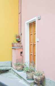
PASTEL ITALIAN VILLA
I’m constantly on Pinterest searching for interesting color combinations for either my graphic design or interior decorating projects.
I love getting inspiration from nature photos or building exteriors and save the ones that instantly make me feel something in my creative gut.
When I came across the super cheerful photo above, I immediately felt a sense of joyful serenity and knew it would be a winner for a future Color Me Happy feature.
It’s such a cheerful color combination grounded with some beautiful neutral colors and greenery to keep it from feeling too cutesy and saccharine.
I created two mood boards using a palette from this inspiration photo so let’s dive in!
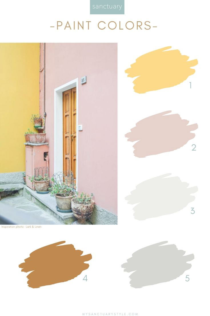
1. Surfboard Yellow | 2. Calamine Pink | 3. Extra White | 4. Toffee Tart | 5. Fog
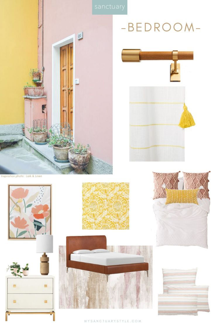
Curtain Rod | Tassel Curtains| Framed Canvas | Wallpaper | White Duvet Cover
Pink Pillows | Yellow Pillow | Nightstand | Plants
Lamp | Area Rug | Leather Bed | Striped Bed Linens
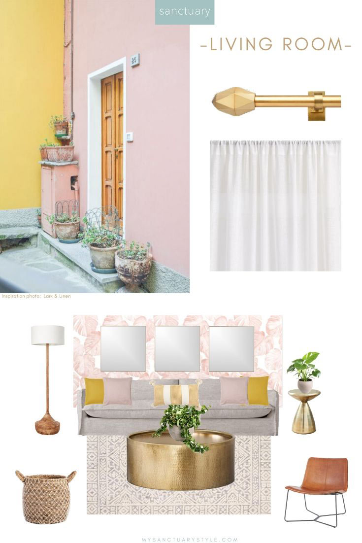
Curtain Rod | Flax Linen Curtains | Floor Lamp | Wall Mirrors | Wallpaper
Sofa | Pink Pillows | Yellow Pillows | Striped Pillow | Side Table
Monstera Plant | Coffee Table | Hoya Plant | Area Rug | Basket | Accent Chair
These mood boards are just basic starting points, but you can always get more creative with the color combinations by using the palette as your guide.
Just remember this: Decorating is and should be fun – it shouldn’t stress you out. If it does, somethin’ ain’t right …
Thank you so much for following my blog and for letting me help you create your own lived-in, loved-in spaces!