I am beyond excited to share this feature article with you today!
I’ve had the idea for this feature post bouncing around my tiny head for a while and I’m thrilled to finally get it out of there.
For as long as I can remember, I’ve been the paint color and home decor “go-to” for my friends and family. Whenever any of them wanted to freshen up their homes, they usually asked me for advice which I’ve always happily given. And today, I’m going to share my many years of color selection expertise with you!
MY ARTSY-FARTSY BACKGROUND
I’ve been a graphic designer for roughly 15 years now so it’s become second nature for me to work with color combinations. Whether I’m about to design a logo, ad graphics, or a website, I typically start each project by searching the Internet for photos that inspire me.
It can be anything – nature, homes, clothing, another website, whatever. If I see really interesting color combinations that resonate with me, I’ll use those as foundations for creating color palettes for my graphic design projects.
I have also been a professional portrait (pets & humans) photographer since 2016. This additional creative outlet has helped me hone my skill set even more since I need to know which color combinations are going to look incredible in photographs, while also ensuring my clients look their best by wearing colors that complement their features.
Through these experiences, I have developed a very keen eye for paint and home decor colors and I’m super excited to share my process of choosing color combinations with you today!
 GETTING OVER YOUR FEAR OF USING COLOR
Over the years, I have discovered that a majority of people are terrified about introducing color into their homes. At first, this common phobia didn’t make any sense to me because I have always infused our homes with all kinds of color since my soul naturally craves it. I assumed others liked to decorate with lots of color too. I couldn’t have been more wrong.
By helping people choose paint colors, I have learned that their initial fear of picking an actual color other than beige is typically because they believe it requires a permanent commitment from them. But I quickly remind them that “it’s only paint” and walls can be repainted if they don’t like the outcome.
Paint is by far the quickest and least expensive way to transform your home in just a matter of a few hours. You’ll instantly feel a new energy in your home you never knew it could have, and it will make you crave that newfound energy even more. This craving can be highly addictive and before you know it, you’ve painted every effing room in your house. I know because – been there, done that …
So if you’ve always been afraid to introduce color into your home – fear not, my friend. I’m going to give you the tools you need to learn how to pick a color palette for your home that nurtures your inner creativity and soul. And my hope is that these tools will give you the courage to take risks and experiment using color in your home.
Just remember this: there’s a reason why nature is loaded with effortlessly gorgeous color combinations – these beautiful displays of art constantly give our souls energy and inspiration!
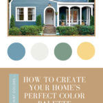
STEP 1: FIND AN INSPIRATION
PHOTO FOR YOUR PROJECT
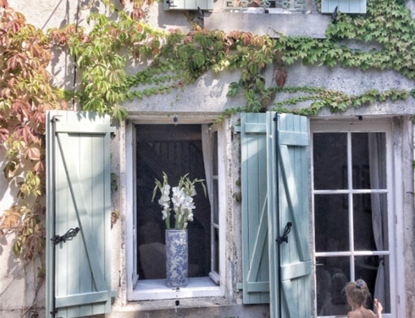
I found the image above on Southernliving.com (by photographer, Alison Miksch) in their Curb Appeal section. I immediately fell in love with the subdued bluish/greyish main paint color of the house, the crisp white trim, and the pops of green and yellow in the landscaping.
HOT TIP: If you’re new to using color in or on your home, take baby steps and use colors that aren’t crazy bright but are more “safe” such as this home’s paint color. Because the tone of this blue/grey is restrained, it actually becomes a “safe” neutral backdrop to introducing other colors. Colors other than beige and grey can become neutral colors if you know how to choose the right tones.
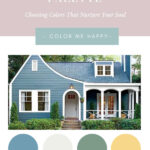
So using the 4 colors that resonated with me (the grey/blue, white, green, and gold), I came up with paint color palettes using 3 of the most commonly-used paint brands: Sherwin Williams, Benjamin Moore, and Behr.
I usually try to pick out at least 4 colors to make a palette but you may certainly use more. However, I don’t recommend using less than 3 colors in a palette in order to create a more balanced look and feel throughout your home. If you’re having difficulty choosing 3 colors, you can always use accents of black or white in addition to 2 colors you really like to create a balanced palette.
Here are the 3 paint brand palettes I created using those 4 colors:
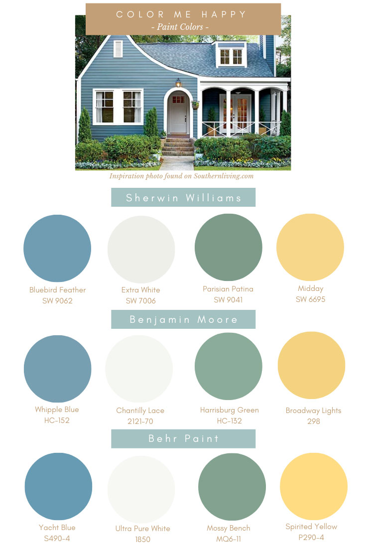
COLOR VISUALIZERS: Sherwin Williams | Benjamin Moore | Behr Paint
STEP 2: FINDING ACTUAL PAINT
COLORS FOR YOUR PALETTE
I went to the color visualizers on each of the paint brands’ websites (see the links below the palettes above), clicked on each relevant color family (blue, green, yellow, etc.) and scrolled through each swatch until I saw a color that matched my inspiration photo as closely as possible.
HOT TIP: I highly recommend having 2 separate browser windows open so you can compare the paint swatches with your inspiration colors side by side.
Once you have your paint palette picked out, you can then visit the store and get some samples made to test out in your home. That’s the super fun part!
STEP 3: FINDING HOME DECOR
USING YOUR PALETTE
So the 4-color palette I created doesn’t only apply to paint colors – it also applies to furnishings and home decor!
In addition to paint colors, I consider the foundations for an interior decorating project to be large furniture items (sofa, love seat, accent chairs), wallpaper, tile/flooring, and base throw pillows. These items really set the tone in a space.
You can then pepper in smaller home decor objects like side tables, artwork, vases, books, houseplants, additional throw pillows and blankets, tchotchkes, or whatever lights you up.
But it always helps to start with a foundation – that will give you some direction of where to begin your project and it should start to get you excited about designing your project.
As an example, here are some possible home decor foundation items using my 4-color palette:
 1. Yellow Sofa | 2. Blue Chair | 3. White IKEA Love Seat (with custom slipcover) | 4. Terrazzo Wallpaper
5. Green Sofa | 6. Peacock Wallpaper | 7. Blue Pillow | 8. Yellow Pillow | 9. Green Pillow
10. Blue Tile | 11. Custom Cement Tile | 12. Green Tile
This design board should give you an idea of how you can use the palette you created to select furnishings and decor for your home, knowing that they will all seamlessly work together. This is just a basic starting point, but you can always get more creative with the color combinations by using the palette as your guide.
Remember this: Decorating is and should be fun – it shouldn’t stress you out. If it does, somethin’ ain’t right.
I think most of the time, people get super stressed out about decorating because they’re overwhelmed by the seemingly unlimited choices that are out there. However, if you start out with a basic plan (your palette), it will guide you towards making the right selections for your home and things then have a way of organically falling into place.
Selecting a palette helps give you more of an idea of what you’re looking for because it’s helping to narrow down the options for you. It will help instill confidence behind your selections, which will also end up saving you money in the long run. And using your palette as your guide will pretty much guarantee you will absolutely love the finished product since there’s a reason why you picked the colors to begin with.
Thank you so much for following my blog and for letting me help you create your own lived-in, loved-in spaces!