I can’t believe it’s been 2 months since I wrote my last blog post but I have a really good reason – I swear! I decided it was time to finally check something off my design business “Goals” list that’s been haunting me for a couple of years.
Last June, I purchased an amazing online course to learn SketchUp and LayOut and was more than halfway through the course, and then – BOOM! – life happened. Our sweet elderly rescue dog, Maggie Moo, passed away, and then both of my client design projects kicked into high gear (one was a kitchen remodel) and so I had to shelf the course for a bit.
Since we’re (hoping) to move to the Orlando area very soon, I purposely haven’t taken on any new client projects, and my 2 current client projects were on pause in February and March (they’re both phased projects). So I decided to take advantage of the situation and took the courses over the last 2 months and so glad I did. It was a lot of hard work and I can’t wait to share my newfound skills with you in future blog posts!
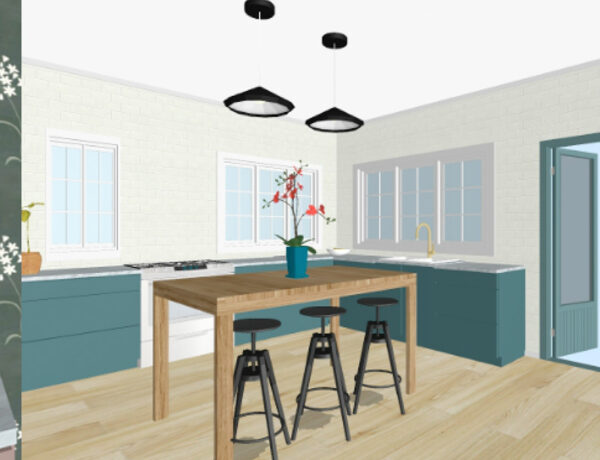
SketchUp is a 3D modeling software program that architects, interior designers, furniture designers, contractors, and the like, use to draw blueprints, plans, and 3D renderings of spaces and products. If you’re a fan of HGTV or Joanna Gaines, you’ve seen SketchUp in action when they show 3D tours of homeowners’ current spaces and what they’ll look like after renovation.
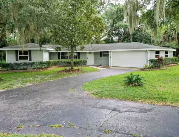
And a few weeks ago, we went up to Mount Dora for a few days to meet with our general contractor and his architectural designer to go over the proposed conceptual drawings for our new-old cottage project. This whole process has been, um, quite interesting to say the least and I’ll go into more detail in an upcoming post. But I went through the electrical plan last week as well as made some tweaks to the plan and we’re currently waiting on the revised plans. But we’re (slowly) making progress so … WAHOO!
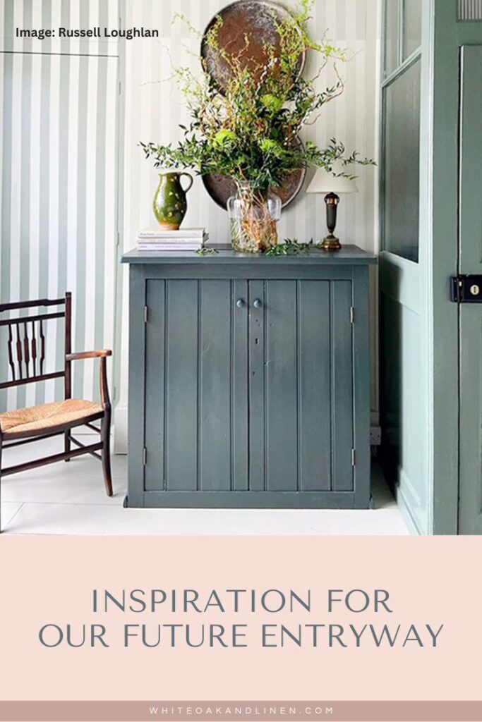
While we’re waiting to get the revised plans, I thought I’d share some inspiration photos for our future entryway. It’s not going to be very big (around 7’x7′) but I want it to be packed with character and charm to immediately set the mood for visitors as soon as they enter the space. It also needs to be very functional.
My design goals are to create some storage for our dog-walking gear, and shoes & boots, and include a seating area to easily slip on shoes, etc. I also want to provide ambient lighting (preferably something on a timer) and an overall cozy, relaxing vibe.
Come check out the inspo photos below (my design notes are listed under each photo) and drop me a comment and let me know which one is your fave – I’d love to hear from you!
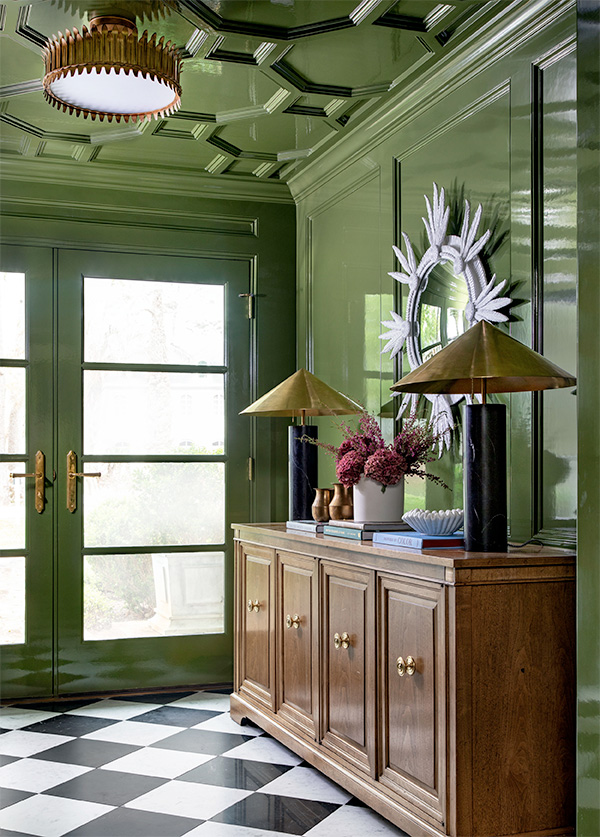
Note: The high-gloss paint (walls and ceiling) and the checkered flooring.
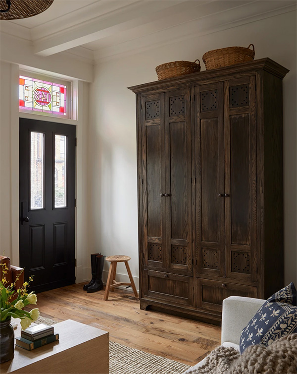
Note: The vintage armoire for storage.
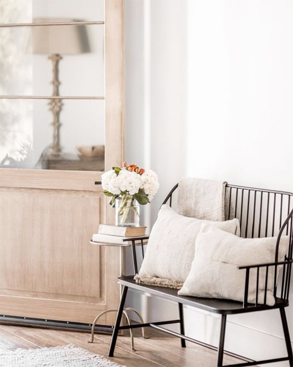
Note: The small scale of the Windsor bench.
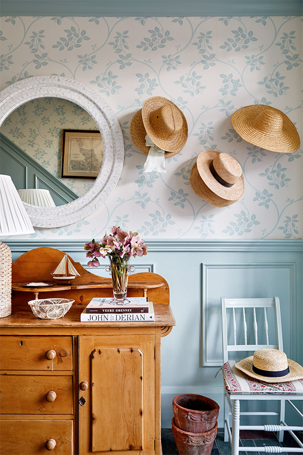
Note: The vintage cabinet flanked by a vintage chair.
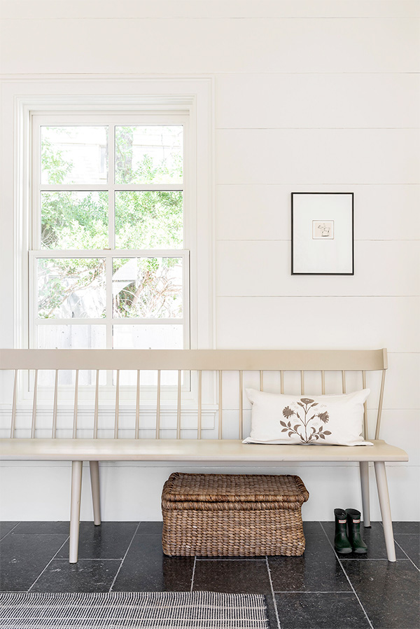
Note: The long Shaker-style bench.
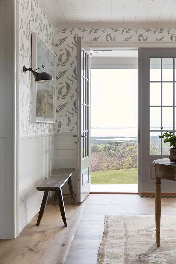
Note: The tongue & groove (T&G) wainscoting and ceiling.
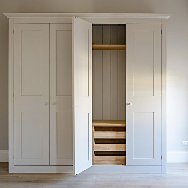
Note: The built-in cabinet for storage.
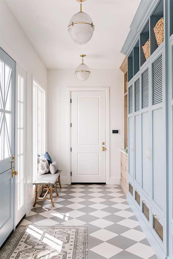
Note: The checkered flooring in subtle colors.
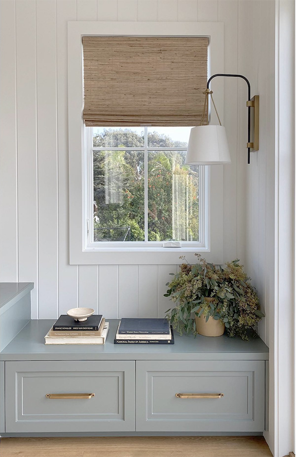
Note: The built-in bench with storage, and side-mounted wall sconce.
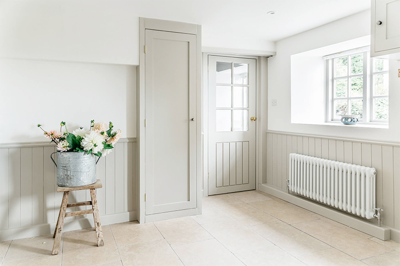
Note: The wainscoting, door, built-in cabinet, and paint color.
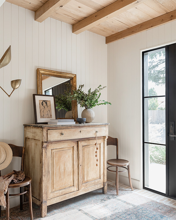
Note: The vintage cabinet flanked by vintage chairs.
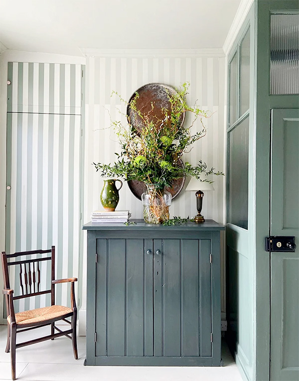
Note: The vintage Shaker cabinet (and its paint color!) and vintage chair.
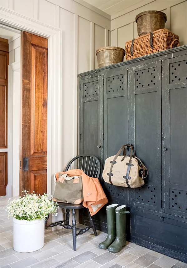
Note: The vintage cabinets.
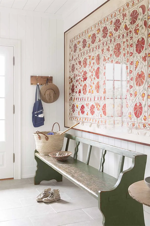
Note: The vintage bench, limestone floor, and framed vintage suzani.
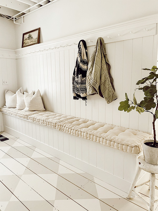
Note: The built-in bench, Shaker peg rail, and subtle checkered floor.
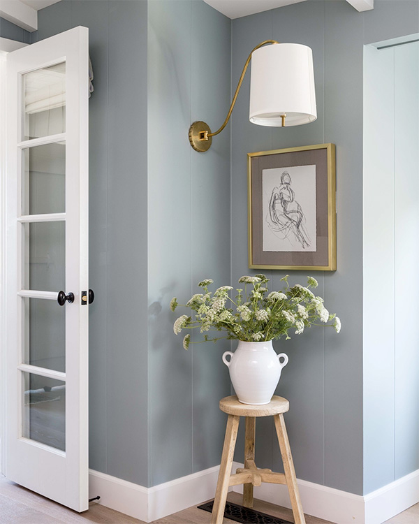
Note: The wall sconce mounted on a side wall.
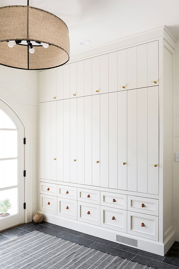
Note: The built-in cabinetry.
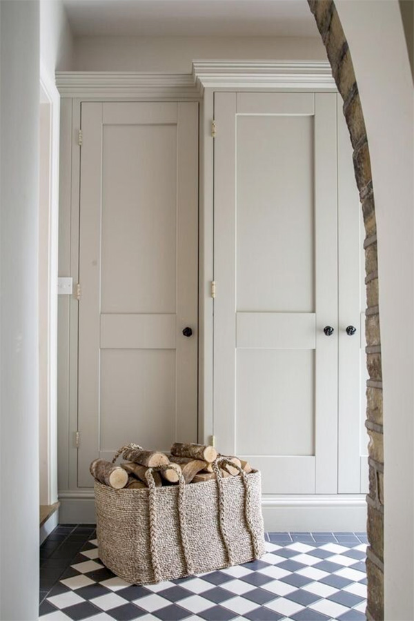
Note: The built-in cabinetry.
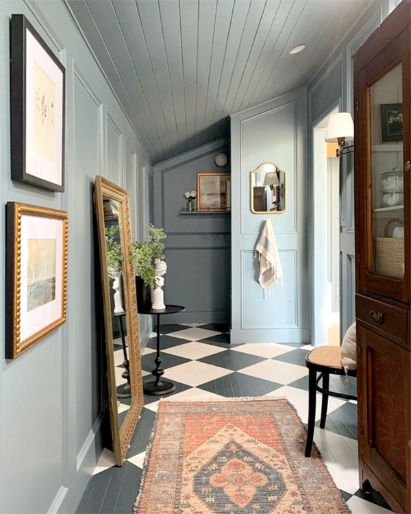
Note: Carrying the paint color to the ceiling, and the checkered floor.
If you enjoyed reading this article, make sure to sign up for the weekly newsletter below so you never miss a post.
Thank you so much for following my blog and allowing me to inspire you in creating your own lived-in, loved-in spaces!


