Back on June 4th, I wrote a post about some inspiration for various elements of the kitchen for our future “new-old” cottage. You can read all about it here in case you missed it.
Today, I’m going to deep dive into one of those kitchen design elements: the stove area.
Since I was diagnosed with Celiac Disease and food allergies in early 2011, I have not eaten in a restaurant. For me, it’s just not worth the potential risk of eating cross-contaminated food and ending up in the hospital. Been there. Done that.
Because of my food issues, I cook pretty much every day in some capacity. It could be a super quick meal like gluten-free/dairy-free mac-n-cheese, to a full-on big meal, to making pizza from scratch, to baking pies and cookies (my weakness), and everything in between.
Needless to say, our current kitchen gets a LOT of use so it’s super important for me to get the design of our future kitchen right the first time because there won’t be any re-dos. One and done, baby.
Of course, I want our future kitchen to be beautiful. But that beauty also needs to be married with practicality and functionality because it needs to be an efficient workhorse since it will be a small room. Our current kitchen is small and has been an incredible workhorse for me over the last (almost) 5 years.
It’s also a space where I’ve experienced a couple of minor bugaboos with the design that I will need to address for our next kitchen (Psst… Pantry – I’m looking at YOU). I put a lot of thought into any space I design – for my clients or my own family – and really envision how every inch of that space is going to be used as well as address any wish lists and possible problem areas.
Here is my wish list for our future kitchen:
• Lots of windows since the property has a lot of shade from antique oak trees
• As much counter space as possible since I like to spread everything out when cooking
• Rounded corners on the island. I’m short and my hip bones constantly bang into the corners
• Would love a stove alcove, but it needs to have adequate counter space on either side
• A simple range hood (or no hood at all!)
• Would love to have the stove near windows
• Sink in front of windows
• Farmhouse or vintage sink with wall-mounted faucet
• Either a set of French doors or accordion windows out to the screened porch
• Better functioning pantry
• No wall cabinets (can’t stand them) and want something other than wall shelves this time
• Space for the dog food bowls for our 2 dogs
• Fridge and microwave are hidden from sight
• Dishwasher blends in with the cabinetry
• Trash & recycling hidden in cabinetry
• Electric or induction 30″ stove, but preferably 36″
• Eating nook since the island will not have seating
• LOTS of character and charm
Phew! That’s some list, huh? The first kitchen design element I need to figure out is the stove area because I feel that it’s going to set the tone for the whole kitchen, so that’s what we’re gonna chat about today.
Let’s begin with the fact that I am not a fan of large statement hoods. While I appreciate the beauty and design of the ones I see all over social media, I’m just not a Big Hood Girl at heart. I’d rather the ventilation components be concealed so the focus will be on either a statement stove or statement tile, or both!
I really LOVE the entire stove alcove area designed by Studio McGee shown below. The gorgeous Lacanche range is allowed to be the star since it doesn’t have to compete with any other elements. But the surrounding alcove definitely wins Best Supporting Actor because of all. that. gorgeous. texture. from bricks and shiplap. Brilliantly done. 😍
I also really love the charm of English-inspired full alcoves like both of the kitchens designed by Sabbe Interior Design shown below. However, I don’t find them entirely practical, especially if there isn’t much counter space on either side of the stove. Who wants to be constantly shuffling between the stove and island because there’s no space for things like hot pots, cutting boards, utensils, etc? Um, not this moi.
I also love the thought of having the stove in front of a window like the kitchen designed by Kate marker Interiors shown below. But I’m not sure how practical that is either – I imagine any steam from boiling water or whatever will fog up the window and leave a big greasy mess behind on the glass.
So I’m on a quest to design a stove area that has a fully-functioning alcove with hidden ventilation and windows and I’m up for the challenge! I have some ideas I need to start sketching out like… RIGHT NOW.
Down below are 15 of my current favorite inspo pics of stove alcove areas along with notes of what I like in each of them.
I’d LOVE to hear your thoughts on these beautifully-designed kitchen stove alcoves so don’t be shy!

Note: The simplicity and minimalism of the full alcove

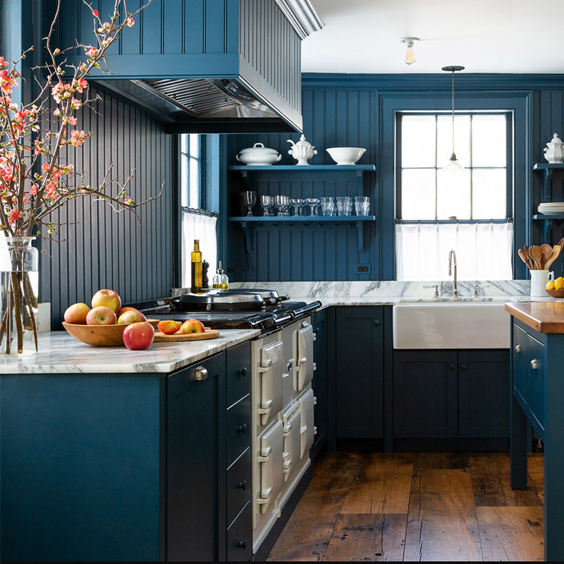
Note: The hood range that is “hidden” in with the vertical shiplap wall

Note: The texture of the antique beam paired with the tile’s splash of color

Note: Range hood blends in with beadboard walls

Note: The quirky, imperfect tile above the range

Note: The arched, full alcove and the simple tile over the range

Note: The partial alcove nestled in between windows

Note: The concept of the stove in front of a window bank

Note: The entire alcove area – has so much character!

Note: The antique stove and the green cabinetry – so charming

Note: The full alcove and the charming hanging pot rail

Note: The dark wall in the full alcove against the
copper pots (and can we talk about that gorgeous island??)

Note: The full alcove blends in with vertical shiplap walls, and the pots!

Note: LOVE all the texture with the brick and vertical shiplap

Note: The full alcove, especially the stunning tile and sconces

If you enjoyed reading this article, make sure to sign up for the weekly newsletter below so you never miss a post.
Thank you so much for following my blog and allowing me to inspire you in creating your own lived-in, loved-in spaces!


