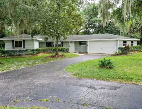
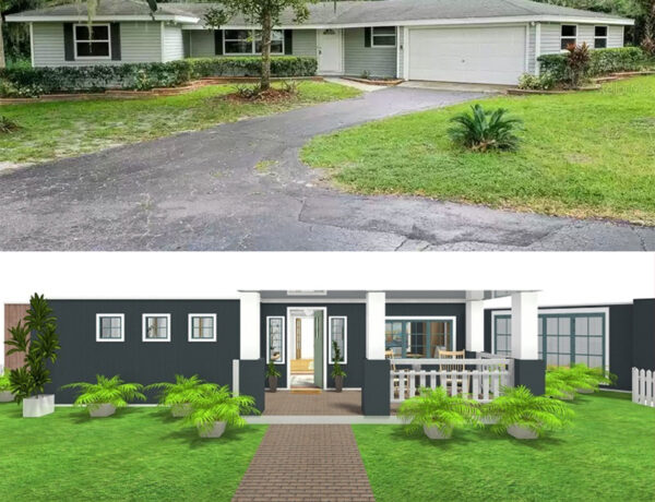
It’s been a hot minute since I blogged about our future new-old cottage (last time was in March!). If you’re new here and don’t know what the heck I’m talking about, you can get all caught up here and here.
My main goal is to design our 1970s fixer-upper to look like it was built in the 1920s to fit in with the historical houses throughout the neighborhood. But I also want to give it a fresh feel by mixing a few different design styles that will give a nod to the past while also feeling current.
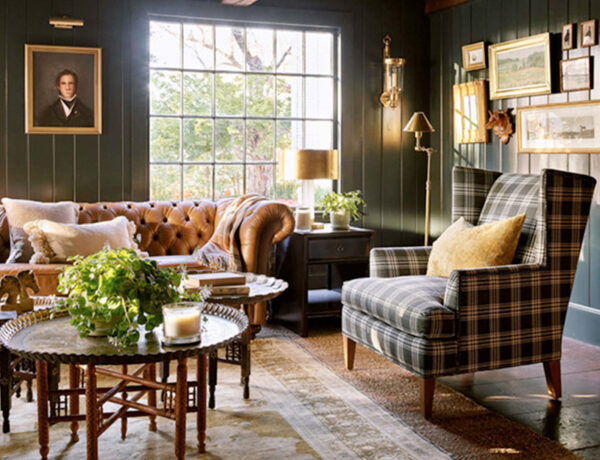
I’ve always been in L-O-V-E with quirky, yet traditional, English designs and how they’re overflowing with character and charm. I also love how delightful and visually delicious they are (is that even a thing? Well, it is now – ha!). Basically, one can’t help but smile when looking at this design style.
But I also want to inject some California vibes as well – relaxing, casual, and effortless in the best way possible. I want guests to immediately feel relaxed, comfortable and at home as soon as they step into the cottage.
One tall order, huh? I’ll be honest – it can be a bit daunting to think about but I’m SUPER stoked about the vision I see in my little brain. However, that design vision is ever-changing which is actually really important in the planning process of any renovation project.
Soapbox Time: NEVER rush through the planning process just because you want to get a project started quickly – you will end up regretting it. Mark my words.
When you rush through the process, you most likely won’t be in love with the finishes and materials you hastily selected. And in the long run, it will end up costing you more money if you end up replacing those things that you have come to despise looking at day in and day out. So if you have the ability to do so, take your time and put a lot of thought into your project to make sure it’s done right, which is exactly what I’ve been doing.
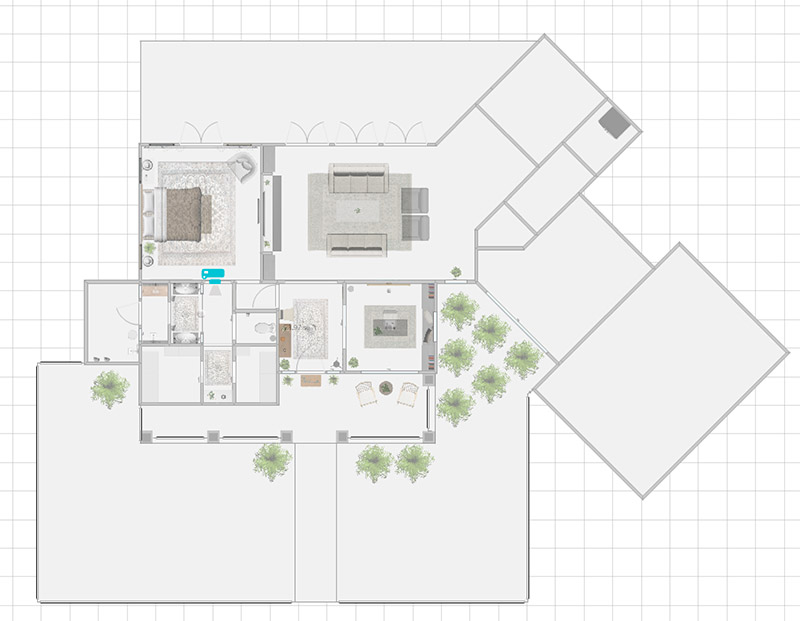
The existing floor plan is SUPER wonky and the house is tiny at 1,300 square feet. And for the life of me, I can’t figure out why the builder decided on building an angled house because the lot it’s situated on doesn’t call for one. So it’s been challenging coming up with a floor plan that will be efficient and suited to our lifestyle and needs all while taking in the breathtaking backyard views.
Here’s the existing layout:
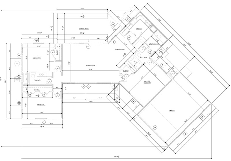
For the last few months, I’ve been working on a floor plan that will allow the most important rooms (primary bedroom, living room, and kitchen) to take advantage of the beautiful backyard views. And in order to do that, I moved the primary suite from its current location in the angled part of the house (which has absolutely NO views) and relocated it to the left part of the house where the 2 bedrooms and bath are currently located. And I also gave the primary bathroom an outdoor shower which has been on my wish list for a long time.
Since this house is built on a crawlspace foundation, it’s much easier and less expensive to move plumbing around than it would be with a cement slab foundation, so at least that works in our favor and I’m definitely taking advantage of that!
I also added a foyer (I cannot stand walking right into a house – our last house was like that and I hated it), a small office for The Hubs adjacent to the foyer, expanded the living room just a bit, and added a large front porch (we basically live on our current front porch). The “mangled” angled part of the house gave me a headache anytime I worked on that area so that’s where I stopped.
This is what I initially came up with:
I say “initially” because last week, I had an epiphany after thinking about how long the walk with groceries would be by keeping the kitchen where it is (the upper right-hand corner in the existing layout). You see, we’ll be converting the current garage into living space and then we’ll build a new garage which we originally planned on locating close to the current garage.
So I went back to the drawing board and relocated the kitchen/dining areas to where I originally moved the primary suite. This way, we could build the new garage on this side of the property instead which would help balance out the house, as well as be able to build an enclosed breezeway to the house creating an easier route to the kitchen. The mudroom and laundry room would be located in the breezeway since we want the machine noise far away from any bedrooms or the living room (that’s a pain point in our current house).
I don’t have all of my new ideas sketched out yet so I don’t have anything to show you right now but this time, I’m creating the new layout starting with the kitchen design which is the real reason for this post. Yes, I FINALLY made it to the actual topic of this post. Ha!
Here are just a few inspo pics for our future kitchen. If you want to see a lot more kitchen inspo for our cottage, head on over to my “Our Future Cottage” Pinterest board.
I’d love to hear your thoughts on any of these inspo pics so shout ’em out down below!

Note: The paneled fridge & the adjacent shelving

Note: The layout of this area & the shelving above the stove

Note: The delicate tiles & the quirky brass faucet

Note: The glass partition

Note: The French doors to the backyard

Note: The ceiling detail

Note: The quirky, imperfect Zellige tile on the wall

Note: The simple, freestanding kitchen island

Note: The cabinet paint color

Note: The layout of this kitchen

Note: The whole breakfast nook

Note: The kitchen layout & the range area

Note: The steel doors & inside/outside living

Note: The glass partition

Note: This gorgeous island, especially the rounded corners

Note: The paneling & the shelving

Note: The steel & glass partition

If you enjoyed reading this article, make sure to sign up for the weekly newsletter below so you never miss a post.
Thank you so much for following my blog and allowing me to inspire you in creating your own lived-in, loved-in spaces!