The thought of giving any room in your home a makeover can be both exciting AND daunting at the same time.
And I get it: there are a crap ton of decisions to make and that can be absolutely PARALYZING for anyone. The paralysis sets in because you don’t want to make any costly mistakes so you end up not doing the project at all (sound familiar?). This is where hiring an interior designer can save you time, money, and your sanity.
Over the next few months, I’ll continue to share my process (from start to finish) of how I’m helping my awesome clients give their living and dining rooms the makeover of their dreams. Make sure to read Part I of this series first to get all caught up.
I hope that by showing you my styling process broken down into bite-sized pieces, you’ll be inspired to tackle your own long-overdue dream room makeover too!
BEFORE: THEIR LIVING ROOM
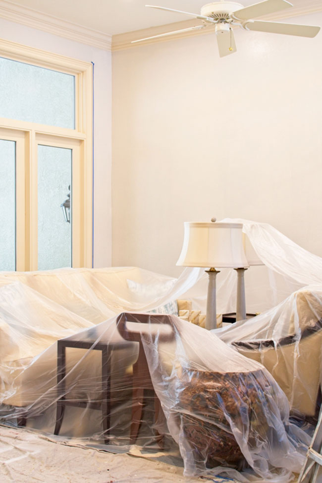
The photo above is my clients’ (Ellen and her sweet family) “Before” living room. To the left is the kitchen, to the right is the master bedroom, and the French doors lead out to the pool area. Now while this space is nice, it’s way too formal for their fun-loving personalities and they barely use this room which is a shame because the natural light in this space is absolutely gorgeous.
Ellen’s family loves to read (they have TONS of books), play board games, and work on puzzles, so she craved having a dedicated space where the family can just chill and enjoy their favorite activities together. She has been dreaming of spaces that are light and airy, and cozy and inviting so that’s what I’m going to help her create.
And notice I keep using the word “help” because I truly make it a collaborative experience with my clients, teaching them how to think about the purpose of each room and how it will be used. I really enjoy helping my clients feel empowered and confident when they’re making their design decisions and that helps gets them super excited about all of their project’s possibilities!
 Making some Light & Airy progress with paint!
Our first step in achieving Ellen’s Light & Airy requirement? Paint, paint, and MORE PAINT. These rooms have had the same blue walls for over 10 years and Ellen was ready for a change but wasn’t sure which color to choose.
The main challenge for painting the rooms in Ellen’s house is that there is a TON of trim that’s a deep off-white color (close to Sherwin Williams’ Biscuit). We needed to keep the trim paint color because it would cost a fortune to repaint all of the trim throughout the house and it’s just not worth spending the extra money. That money would be better spent on new furniture and decor the family will enjoy.
Over the years, many of my friends and family members have asked for my help in selecting paint colors for them. I’ve become their “go-to paint chick” because they know I’ll end up picking something they never would have picked on their own, but they end up loving it!
Picking paint colors is one of my favorite decorating decisions to make (crazy, right?) and it’s almost become second nature to me. I think it’s from being a graphic designer for many years – I just kinda know what colors will work well with others when creating color palettes for any project, whether for interiors or graphic design.
If you’re not super confident about picking paint colors yet, don’t fret because this is something you can learn and start honing your skills on. I’m constantly inspired by seeing other designers put unexpected colors together and that’s the fun part – learning and absorbing that new knowledge and applying it to your own design style.
If you’re new to picking paint colors or choosing a decorating color palette for your home, make sure to visit my “Color Me Happy” feature series to get some great tips and inspiration for your future projects!
BEFORE: THEIR DINING ROOM
So back to picking Ellen’s new Light & Airy paint color … We had the challenge of picking a neutral wall color that would compliment the deep off-white trim paint color and we wanted it to be fresh, modern, sophisticated, and timeless.
We didn’t want to use a beige color (which would have been the easiest choice to pair with the trim’s off-white color) but rather, a color a bit more on the greyish side.
I narrowed it down to 3 colors for Ellen and then it was swatch time! I wanted Ellen to check the colors during different times of day to see if she liked the way the paint color would change with the natural lighting. The paint was going to be a big investment and I wanted to make sure she was going to 100% love the color she ultimately chose.
 We removed the trim molding from the side of this knee wall making it feel fresh & modern.
Swatching paint colors is the most important part of choosing a paint color and there are 2 different methods I recommend using for this step in the process.
There’s nothing more overwhelming than painting a bunch of colors next to each other on every wall. It seriously becomes sensory overload. You start comparing the different colors against each other instead of focusing on just one color, observing how it changes during different times of the day. That’s hard to do when you have 10 colors all side by side.
So one tried and true way I’ve been doing swatches for years is by using FoamPro’s test sample boards. They’re inexpensive, resemble the texture of drywall, and they have a place on the back where you can record the paint brand, color name, and the date you painted the board. Super convenient!
 AFTER! You’ll notice we swapped furniture from the living room – stay tuned to learn why!
But my latest (and current favorite) way to do paint swatches is using a relatively new product called Samplize. Guys – this product is a game-changer for the typical costly, wasteful, messy process of testing paint samples.
For $6, you get a 12″x 12″ paint sample that is basically a giant sticker and is REPOSITIONABLE!! So now, you don’t have the expense of buying foam boards, paint rollers/brushes, and sample paint. Plus, it’s a smaller impact on the environment since you didn’t create all of that waste with traditional methods of creating paint swatches.
And the colors are exact because they use the actual paint from each manufacturer so you get actual color results. They currently have colors for Sherwin Williams, Benjamin Moore, Farrow & Ball, and Home Depot.
 AFTER! You’ll notice we swapped furniture from the dining room – stay tuned to learn why!
I used Samplize for the first time with Ellen’s project and I gotta say, I don’t think I’ll ever go back to the foam board way again. You can easily peel your samples off of one wall and slap it onto another whenever the daylight is changing throughout the day to see how you like the color.
Plus, what’s awesome as an interior stylist (or a homeowner!) is that I can easily roll up these swatches (they kinda resemble wallpaper) and store them for future use without them taking up much room at all or creating unnecessary environmental waste. Freaking awesome.
THE 3 COLOR CHOICES
I’m sure you’re like, “Ok, this is all fine and great, Michelle, but WHAT THE HELL SAMPLE COLORS DID YOU CHOOSE FOR ELLEN?” I like adding a little suspense throughout the backstory to keep y’all hangin’.
So these were the 3 Sherwin Williams colors I narrowed down for Ellen that coordinated perfectly with the trim’s off-white paint color:
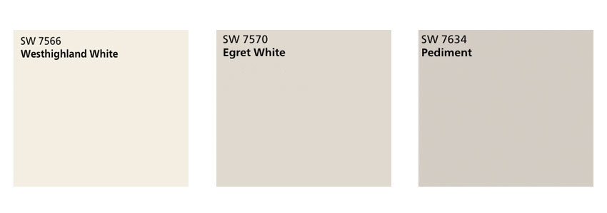
Sherwin Williams: Westhighland White SW 7566 | Egret White SW 7570 | Pediment SW 7634
And the color Ellen chose is … EGRET WHITE!
I was secretly hoping she would choose that color because I LOVED how it looked in the two rooms. I didn’t give my opinion because I wanted Ellen to choose one of these colors all on her own that she genuinely loved and that would bring her joy.
The color looks really beautiful in the two spaces and it definitely lends the Light & Airy look to the areas that she’s been dreaming of. The photos really don’t do this color justice. I haven’t used Egret White before in any projects but after seeing it in Ellen’s home, it certainly won’t be the last!
So what are your thoughts on the paint colors? Which one would YOU choose?
Thank you so much for following my blog and for letting me help you create your own lived-in, loved-in spaces!


