Two weeks ago, we headed up to the cottage for some more “glamping” (I’m using this term very loosely as there was nothing glamorous about our stay in our vacant house – ha!). 😜
Although for our last 2 visits, we had the benefit of having this futon from Target® (and using the box it came in as a coffee table 😂) we bought on sale for $95 which made it a helluva lot nicer than our first glamping experience you can read all about here.
For the last couple of months, in addition to working on 2 large client projects, I’ve also been working on designing the new kitchen layout which, honestly, was making me NUTS.
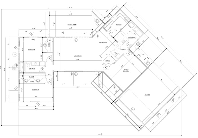
The cottage is tiny (less than 1,300 square feet) and the existing floorplan is bonkers. There is the left half of the house which is pretty “normal” and straightforward, and then there’s the right half of the house which is a HOT MESS. It has all these weird angles and just doesn’t make sense. We still can’t figure out why the original builder thought an angled house was a good idea because the lot it’s on certainly doesn’t call for one.

What really doesn’t make sense about the angled side is that it doesn’t take advantage of the breathtaking views of the backyard. Still scratching my head on that one … But since we don’t want to overspend on this house, we need to keep the current exterior footprint and work with what we have.
As you can see in the floor plan above, the current kitchen is in the upper right-hand corner and it’s teensy tiny. It feels pretty tight with just the 2 of us in there at the same time. Months ago, I was trying to make the kitchen work in this area by removing some walls and reconfiguring it, but I didn’t like it in that location at all. And it really didn’t make sense to keep it there since we’re planning on building a new garage on the left side of the property and that would be a LONG walk with bags of groceries. So back to the drawing board I went.


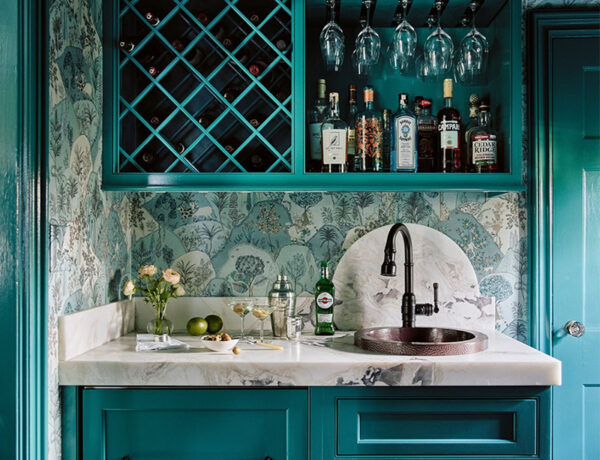
I ended up relocating the kitchen to the left side of the house and creating a walk-through butler’s pantry and adjoining dining room, making a straight shot to the future garage. I created 2 versions of the kitchen plan: one with a 36″ French-door counter-depth fridge, and one with this 28″ Smeg fridge to make the pantry smaller and the kitchen a little larger. Both have a dry bar on the opposite side of the fridge wall.

I’m leaning towards Kitchen A-2 as it creates more space in the kitchen as well as allows for a wider set of French doors to the screened-in porch, which is super important to me.

I also sketched a galley kitchen layout with a huge set of French doors right in the center, but decided the “L” shaped layout works better since we could add a second opening between the kitchen and living room thus creating a better flow between the two spaces.
We taped up where the new doorways to the kitchen would be as well as the fireplace and TV right in between the two (cute, huh?). We’re going to vault the ceiling in the living room so having the taller doorways will make a lot more sense. 😀

I want to add some vintage pocket doors so we have the ability to close off the spaces when I’m clanging around in the kitchen and The Hubs is chilling with his TV. We are not big fans of open-concept great rooms and are looking forward to the separation of these inherently loud spaces.
THE RENDERINGS
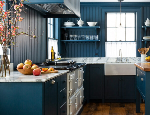
Here are the renderings for Kitchens A-1 and A-2. Try not to pay too much attention to the way the kitchens are decorated – I’m using a “meh” software program and it’s very limited. Thankfully, I’m halfway through my SketchUp course so I’ll be able to share my exact vision with you in the very near future!
Take a peek at the two layouts and drop me a comment below on which one you like better – I would love to hear your thoughts!
If you enjoyed reading this article, make sure to sign up for the weekly newsletter below so you never miss a post.
Thank you so much for following my blog and allowing me to inspire you in creating your own lived-in, loved-in spaces!


