February is going to be a month of purging for me so get ready. I’ve done a bunch of little projects around our farmhouse since Covid hit and never posted about them so here I am now — PURGING. And I’m not gonna lie – it feels damn good!
In October 2020, I started posting about our front door’s mini-makeover project on my personal Instagram. With the ongoing pandemic coming close to the 1-year mark at that time, I was feeling down and quite lonely (I missed seeing friends and family!) and needed a quick and easy pick-me-up project and thought a fresh front door color would be THE perfect remedy.
The black door was starting to feel a bit “Doom-n-Gloomy” for me, so I wanted to turn it into a more cheerful color that would happily greet us whenever we’d pull up to the house.
I wasn’t sure exactly which way I wanted to go at that point: a pretty coastal aqua (my typical go-to) or something a bit different for me – a blushy, peachy pink. Either one would look really pretty paired with the patinaed brass door hardware, but I thought a blushy-peachy pink would really make the hardware shine.
So I merrily jumped into the Internet rabbit hole searching for blush pink front doors and found these gorgeous inspiration photos:


I loved all 5 of these inspiration photos but my favorites were the ones on A Beautiful Mess, French Country Cottage, and Design Shop Interiors.
I found out the color of the door on A Beautiful Mess is “Noble Blush” by Behr and the door shown on French Country Cottage is “Pink Ground” by Farrow & Ball. I can’t remember offhand but I think the one from Design Shop Interiors was a custom color. I orginally found that photo on a blog post of theirs but I don’t think they have that blog anymore. Boo.
So now that I had my inspiration and a few paint colors to go on, I looked at some more paint swatches and narrowed them down to these 5 beauties:

Benjamin Moore Pink Cloud | Clare Baby Soft | Clare Wing It
PICKING THE FINAL PAINT COLOR
Picking paint colors is one of my favorite things to do. And no, I’m not sadocmasichistic. At least, I don’t think I am …
Anyway, I just love the power of paint and what it can do to not only change the look and feel of a space, but how it also can affect your overall mood and wellbeing. That aside, I gotta admit that it was really tough selectcing a final paint color!
I ordered a few peel-and-stick samples from Samplize (for the Benjamin Moore and Farrow & Balls colors) and Clare, grabbed a Behr sample at Home Depot and made my own little sample card for it, and got busy a-swatchin’ the door.
I also found a few beautiful blushy-peachy colors from Portola Paints that I liked so I stuck those fan deck samples on the door as well (those are the little swatches on the right side of the door).
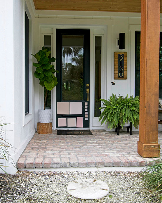


Pink Cloud, Noble Blush, Wing It, Baby Soft
I’d go out there almost every day to see how the colors looked in full sun, or overcast skies, and at different times of the day. After a few weeks of going back and forth on selecting “The One,” I finally landed on Clare’s Baby Soft. Or at least I thought I did.
I never used Clare’s paints before but I’d been itchin’ to find an excuse to try one of their colors and figured this project would be perfect. I went to order a quart online and guess what? They don’t sell quarts OR exterior paint. WHAT THE FRACK, CLARE??
What paint company doesn’t sell quarts or exterior paint? I guess that’s my bad for not looking at that sooner but never in a million years did I think a paint company wouldn’t offer those things. Live and learn, right? Back to the old drawing board …
I had Home Depot color match the Baby Soft color and I got more samples made for Noble Blush as well (at 25%, 50%, and 75% lighter). After throwing these new swatches on the door, it seemed like the perfect color would be a combination of Baby Soft and Noble Blush.
I mixed Baby Soft with the different Noble Blush formulas and swatched those on the door. I’m sure most people would tear their hair out and head for zee hills at this point, but I was quite enjoying the process. Hey – maybe I am sadocmasichistic after all. Ha!

After mixing all those new swatches, I landed on a mixture of the Baby Soft and Noble Blush (at 50% strength) and it’s GORGEOUS, you guys!! I’m calling it “Fuzzybutt Pink” since we named our house “Fuzzybutt Farm” as an homage to our rescue pets (both past & present).
I went back to Home Depot and had them color match my new concoction and got A QUART of their Behr paint (ahem – Clare Paints, if you’re listening …) and it’s STUNNING! This photo doesn’t do it justice, that’s for sure.

ADDING A DRY-BRUSHING TECHNIQUE
I primed the door with this Kilz primer and painted 2 coats of “Fuzzybutt Pink” on both sides of the door. Buh-buy gloomy black door … HELLO, CUTIE PATOOTIE PINK DOOR!
I immediately loved the new color on the door but felt like something was missing. It needed some texture to make it look a bit weathered like the brass door hardware. So I applied a drybrushing technique using one of the darker Behr paint samples and that was the solution. It’s subtle but adds a lot of depth and charm and I’m HERE for it!
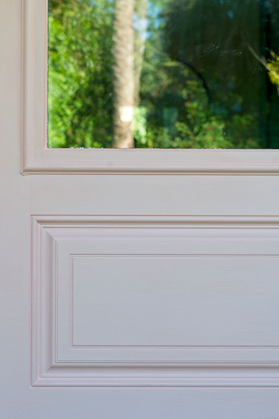

I moved around a few plants and bought this doormat from Home Depot because it’s HUGE and balances out our 8′ tall door much better than most of the regular-sized door mats out there, and then the mini-makeover was finally done!
How cute does she look? GAH! I still love walking through this door at least 100 times during the day (3 dogs will keep you busy with Potty Time!). She brings a smile to my face every time and it’s just what I needed.
So without further ado, here are some more pics of our farmhouse and its fresh new “Fuzzybutt Pink” door!
If you enjoyed reading this article, make sure to sign up for the weekly newsletter below so you never miss a post.
Thank you so much for following my blog and allowing me to inspire you to create your own lived-in, loved-in spaces!


