I am BEYOND excited to share this client project with you today since it’s been my favorite project this year so far!
The reason this curb appeal project is my favorite is not because of the makeover itself (can’t wait to share the “After”!), but because I had the privilege of working with a dream client.
Now please don’t misunderstand – I’m super honored to collaborate with any client that appreciates my work and vision. But when you have that one client that takes your entire vision and runs with ALL OF IT, that’s a really special client because that doesn’t happen very often and designers tend to cherish those clients forever. And that dream client for me is Laura.
Ok, so moving on with my makeover story …
This wonderful human contacted me in February asking if I could draft some renderings of a curb appeal makeover she planned on doing but needed to present to her homeowners’ association for approval first. She had an idea of what she wanted but requested some additional renderings with a few colorways to choose from as well.
We had a 1-hour FaceTime meeting and Laura was absolutely delightful! Super bubbly, friendly, and just had an overall positive vibe about her. We discussed a few different paint color options, and then I had her send me some “Before” and inspiration photos. I was super excited to get started on her project right away – I mean, who doesn’t love a good “Before & After” curb appeal makeover?!
THE “BEFORE”
Laura’s house was a typical brown-ish stucco home in Idaho but it had some really cute features (like the details in the roof peaks and the horizontal siding) and I felt it could really be turned into something special for her entire young family.
HER FRENCH COUNTRY INSPO
Laura dreamed of having a charming French Country vibe for her home’s exterior and sent me these beautiful inspiration photos:
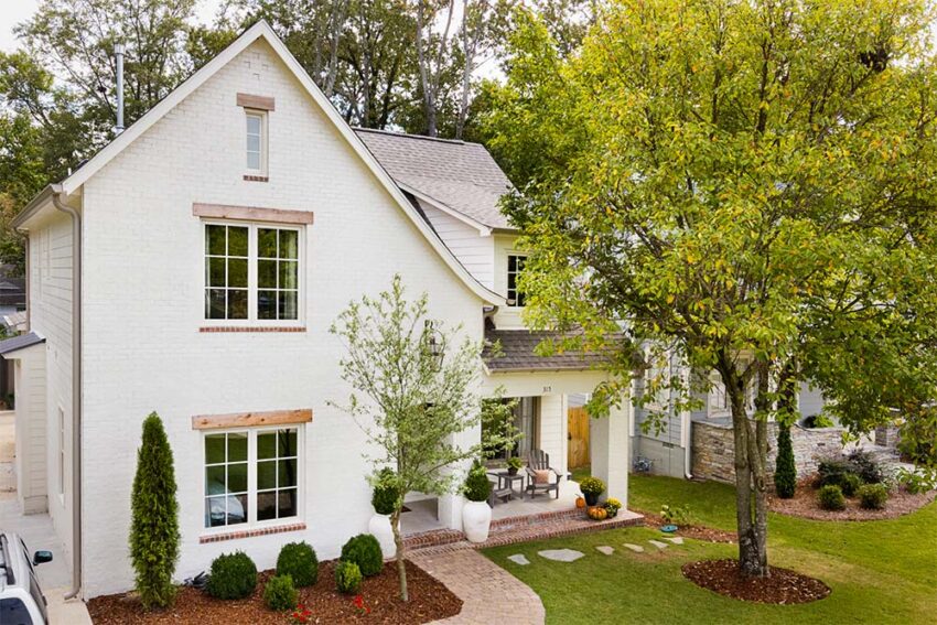
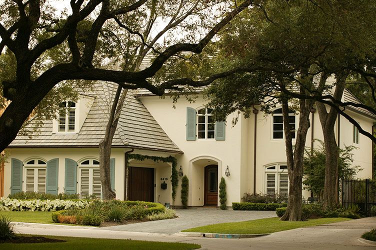
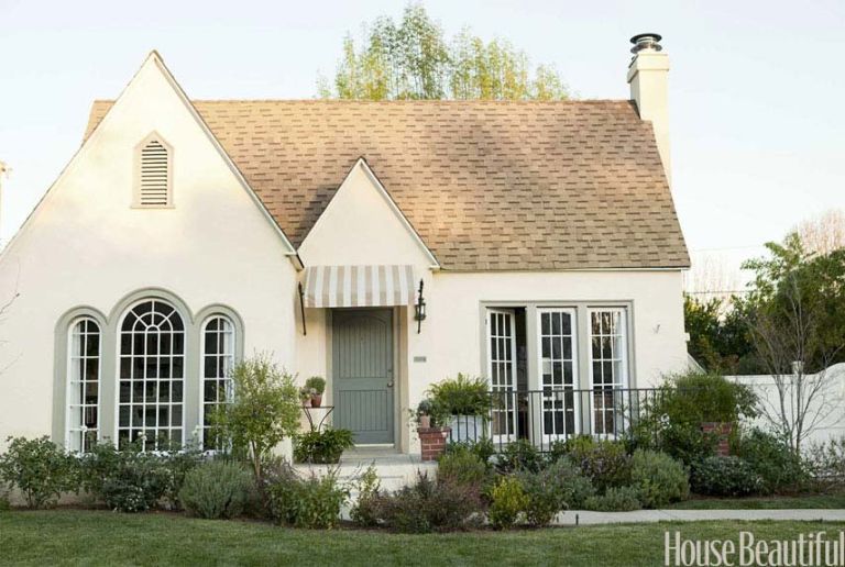
I knew this was going to be a super fun project because I did a French Country-ish curb appeal design for a client’s typical Florida stucco home in 2019 and you can read all about right here.
That blog post continues to be one of my most popular posts – it’s been read over 10,000 times and counting!
THE DESIGN PLANS
Laura thought she wanted the house to be off-white with blue-green accents but also wanted to see what it would look like in a reversed color scheme.
This is the first quick draft (not super detailed) I presented to her showing the reversed colorway:
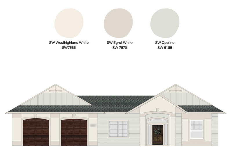
Laura decided right away she definitely didn’t like that as much as she thought she would. God, I love a client that makes quick decisions!
So the next version I showed her was the color scheme and overall concept I envisioned. Laura had also mentioned that she wanted more lighting by the entry area and that she planned on training some ivy over the entry arch in the future so I incorporated those items for her as well in the second draft:
Laura absolutely loved this version (yay!) and requested an additional rendering of it in a grey-blue color she happened to see on a new house in her neighborhood.
So here was the final presentation:
Laura ended up loving them both so much, she wasn’t sure which one to choose and asked for my advice.
I gave her my honest opinion but told her that ultimately, she needs to pick the one that will make her super happy and excited to see every day. And then that little stinker kept her decision secret from me for awhile! Ha!
Which color do you think Laura picked? Drop a comment down below!
Make sure to stay tuned because I’ll have the “After” part of the story next week!
If you enjoyed reading this article, make sure to sign up for the weekly newsletter below so you never miss a post.
Thank you so much for following my blog and allowing me to inspire you to create your own lived-in, loved-in spaces!


