The thought of giving any room in your home a makeover can be both exciting and daunting at the same time. Now more than ever, there are seemingly infinite amounts of choices in lighting, home decor, paint colors, hardware, furniture – the list is endless.
What makes the process even more daunting for many people is “Pinterest Paralysis.”
While Pinterest can be an incredible source of interior design inspiration, it can also create decision paralysis for those that don’t know how to filter out all the “noise.” Once Pinterest paralysis takes hold, people become so overwhelmed by all the eye candy that they end up not doing anything at all which, ultimately, becomes a disservice to their overall well-being.
I believe that beautifully simple, serene spaces feed the soul. We have enough crap on our plates every day to overwhelm our busy minds, and our homes should be our designated sources of rest, inspiration, peace, joy, and safety. If you can feel calm and refreshed in your home, then your mind, body, and soul have an opportunity to become recharged, and that positive energy eventually trickles over into other aspects of your life.
Over the next several months, I’m going to share my process (from start to finish) of how I’m helping my clients give their living and dining rooms the makeover of their dreams.
My hope is that by showing you my styling process broken down into bite-sized pieces, you’ll be inspired to tackle your own long-overdue dream room makeover!
BEFORE: THEIR LIVING ROOM
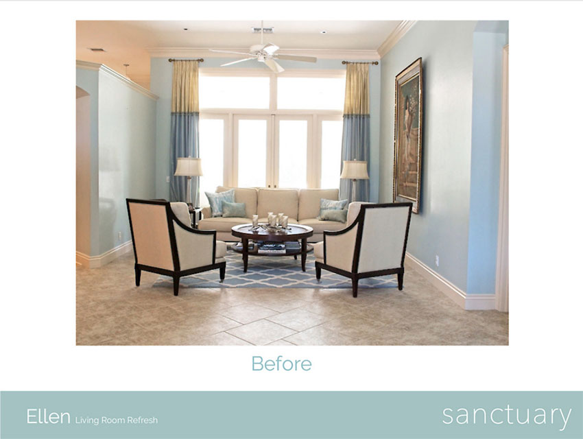
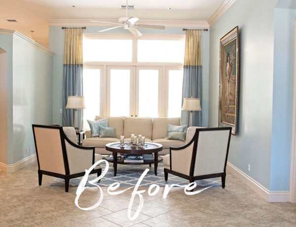
 Ellen’s “Before” Living Room
I started working on this Living/Dining Room Refresh project with my awesome client, Ellen, in April. The project has been taking longer than originally planned because Ellen’s family did a lot of traveling over the summer months, but we started making some progress in the last few weeks.
The above photo is the “Before” of Ellen’s living room. To the left is the kitchen, to the right is the master bedroom, and the French doors lead out to the pool area. Now while this space is nice, the style doesn’t fit her family’s fun and casual personality at all. It feels way too formal and they barely use this room, which is a shame because the natural light in this space is absolutely gorgeous.
I’m a big believer in making sure that every area in your home is used otherwise, it becomes dead space and that actually affects your bank account. How? Well, not only do you need to furnish the space, but you also have to pay the monthly bills to heat/cool the space. So if you’re already paying to do those things, why not make it into a space that you absolutely LOVE spending your time in?
Ellen’s family loves to read (they have TONS of books), play board games, and work on puzzles, and she really craves having a dedicated space where they can just chill and enjoy their favorite activities as a family.
BEFORE: THEIR DINING ROOM
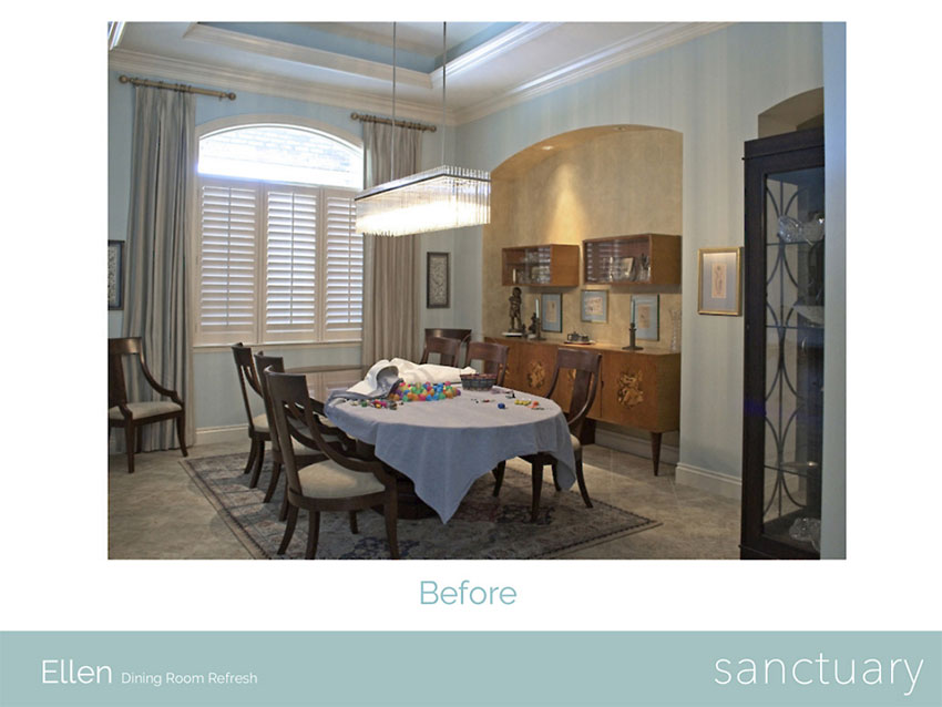
 Ellen’s “Before” Dining Room
Ellen has a large extended family and often hosts family gatherings at her home, so it’s essential for her to have a dining table that can accommodate at least 10 adults.
The credenza in the niche is a cherished family heirloom that she wants to keep, but it doesn’t necessarily need to be in this room.
The dining chairs are over 10 years old, but they are very well-made and super comfortable so she hopes to keep them in the design plan.
She also loves the glam chandelier they purchased several years ago and was hoping to keep it in the design plan as well.
THE DESIGN CHALLENGES
 Ellen’s “Before” Entryway
Challenge No. 1: The main challenge for the entire makeover is the budget. When Ellen and her husband purchased their home about 14 years ago, they bought it at the top of the market and they know their house will probably never be worth that price again.
With this in mind, they’re hesitant to throw too much money into making any improvements they know they’ll never recoup if they decide to sell their home in the future.
Challenge No. 2: The second challenge is Ellen would love all 3 enjoined spaces (entryway, dining room, and living room) to feel light, bright, and airy. The entryway and dining room don’t get a lot of natural light, but the living room does at certain times of the day.
Challenge No. 3: The third challenge is designing timeless spaces that will serve her family’s needs for years to come.
THE INITIAL DECORATING PLAN
When I first met with Ellen back in April, one of the first questions I asked her was, “How would you describe your decorating style?” She said she wasn’t really sure because she likes many different styles.
So while Ellen was giving me the tour of her home, I noticed whenever her face would light up while pointing out certain objects she loved. At the end of our first visit, I told her I thought her decorating style was Modern Traditional with sprinkles of Modern Coastal, California Casual, and Glam.
She was thrilled with the designation of her own unique decorating style and started to get really excited about her rooms’ makeover projects.
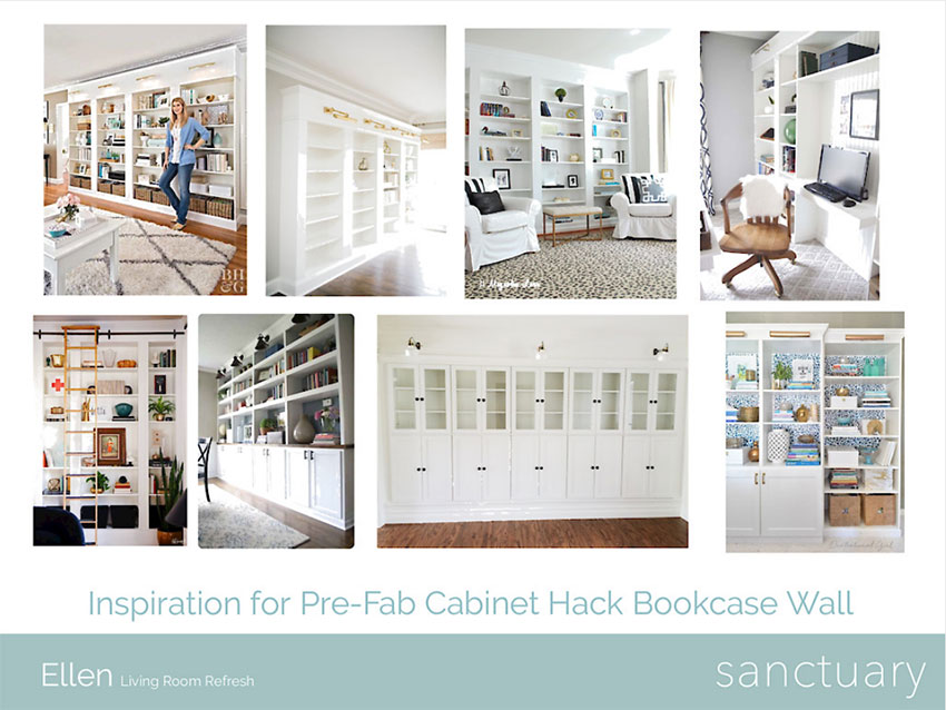
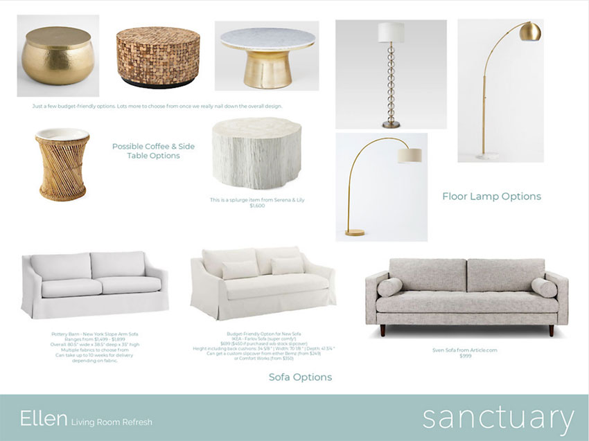
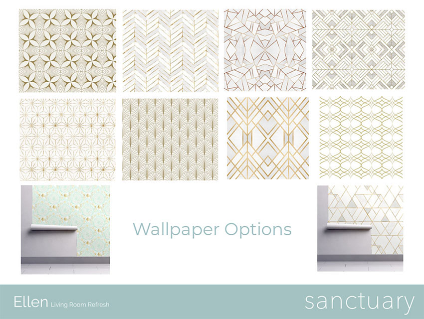
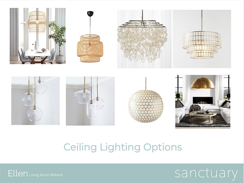
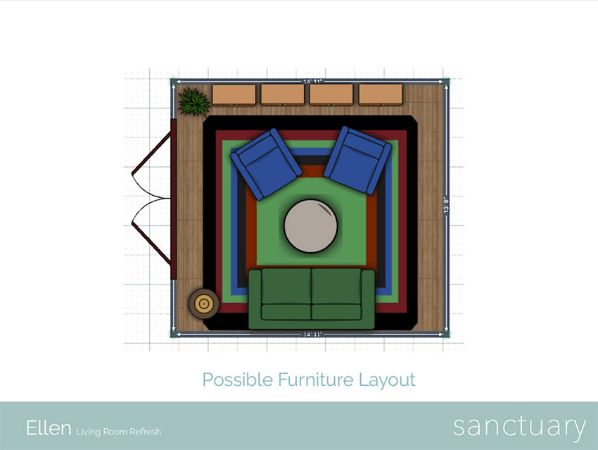
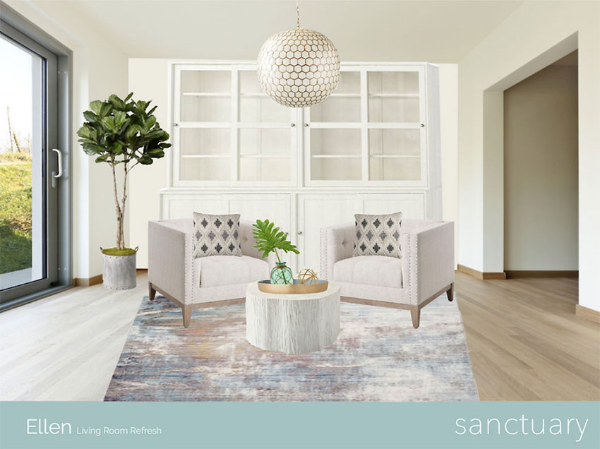
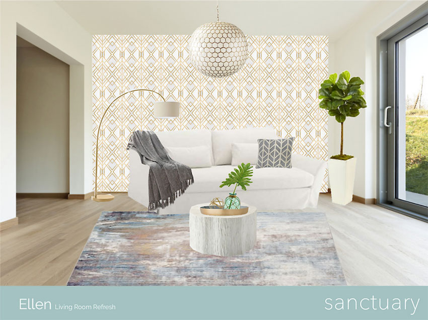
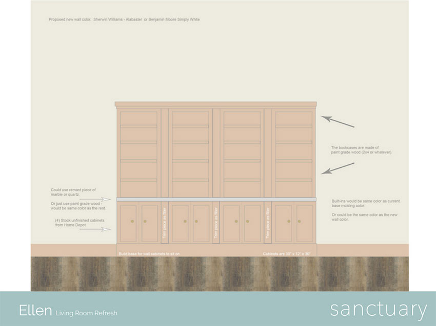
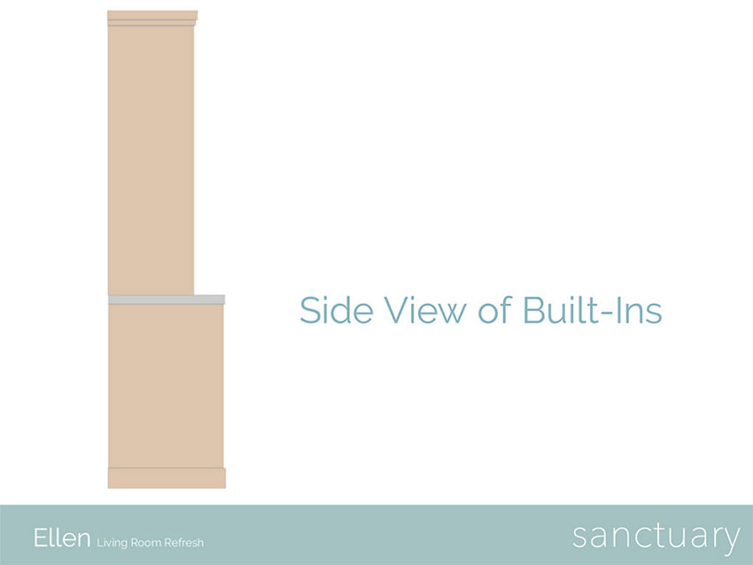
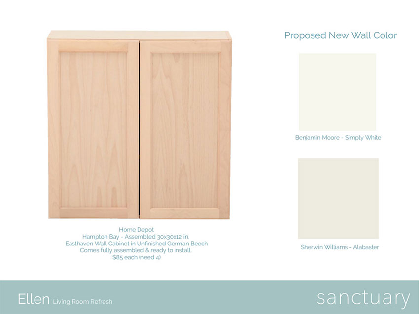
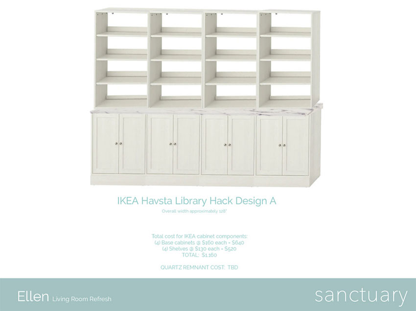
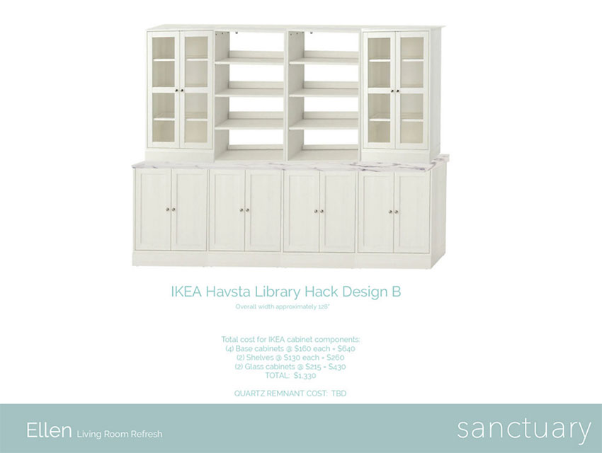
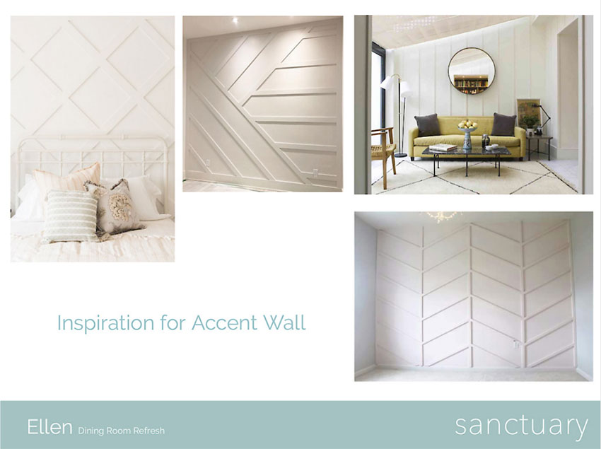
A few weeks after our initial visit, I presented her with the following design boards along with some paint and fabric samples.
(Click any of the images to enlarge)
After the presentation, she said she loved EVERYTHING in the design boards and she rarely likes anything. That was THE best compliment I could ever wish for!
She’s been such a joy to work with and open to so many ideas, making her the ultimate dream client for any interior stylist. I can’t wait for her family to love and enjoy their new spaces once they’re all done!
MAKE SURE TO STAY TUNED …
I’ll be breaking down the decorating plan in upcoming posts – there’s way too much information to cover in just one post and my goal is to inspire – not overwhelm – you.
So what are your thoughts on the initial decorating plan? What are your likes? What are your dislikes?
Thank you so much for following my blog and for letting me help you create your own lived-in, loved-in spaces!


