This is the moment you’ve been waiting (and drinking heavily) for. The LAST EFFING ARTICLE in my “My Design Style Defined. Well, Sort Of …” series! Can I get a “WOOT WOOT!” up in heeerrre?
So to celebrate this momentous occasion, push that warm box of wine aside, break out your pretty champagne flutes and open some chilled bubbly instead. Or whatever gets you drunker faster – your choice, pumpkin.
Let’s move along with my nonsensical word that describes my mish-mosh design style:
#CALISCANDIMIDMODBOBEACHCOTFARMGLAM
We’ve gone over “CALI” , “SCANDI”, and “MIDMOD” , “BO”, “BEACHCOT” , “FARM”, and now we’re on to “GLAM” which represents my next favorite design style:
GLAMOUR (GLAM)
The word “glamorous” would never roll off any of my friends’ tongues if they were asked to describe me in one word. But I’m sure “weird”, “short”, or “weird” would come flying out of their mouths faster than green grass through a goose.
So why did I choose to infuse Glamour style into our farmhouse’s overall design? Because I wanted to elevate the whole look just a notch, but without it feeling too “foo-foo” – it’s a delicate balance. I wanted to create interest by including colors, fixtures, and finishes you wouldn’t think would be found in a typical farmhouse setting.
My interpretation of this design style is a space that feels very luxe and makes a big visual impact through the use of bold colors and patterns. I have a couple of images in my tiny weird head I’d use to sum up Glam style: Marilyn Monroe (famous pink dress version) mixed in with a little pinch of Lady Gaga (but not her meat dress days … it makes me inexplicably hungry).
ESSENTIAL DESIGN ELEMENT #1:
BOLD, RICH COLORS
I can tell you firsthand that for some strange reason, people seem to be really afraid of painting something a color, let alone a bold color. IT’S PAINT, PEOPLE! IT CAN BE PAINTED OVER!!
It makes me a bit crazy when people shy away from using anything other than greige in their homes. Meanwhile, they have no problem going out in public looking like they just came back from following The Grateful Dead on tour. Then it’s all, “NEUTRAL COLORS BE DAMNED!! I’M WEARING THE BRIGHTEST, MOST PSYCHEDELIC COLORS I CAN POSSIBLY FIND!” Makes my head hurt.
Our farmhouse is the first home I’ve ever lived in that didn’t have color on all the walls. When I designed our farmhouse, I decided to go all-white on the walls because I really wanted all the woodwork to take center stage. But honestly, it was making me crazy to think that every effing wall was going to be white.
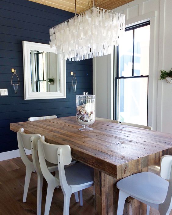
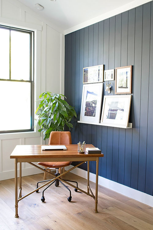
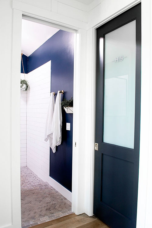
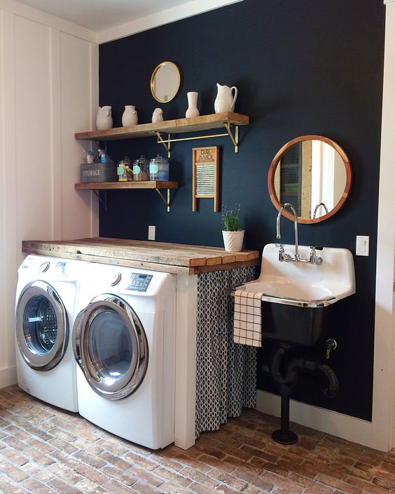
So to combat the dreaded idea that we’d feel as if we were living in an insane asylum, I decided to use bold, inky blues on select walls throughout our home. That turned out to be the perfect compromise and is a great solution to anyone that’s afraid of using any color other than beige or grey in their homes.
Pick a couple of accent walls and go balls-to-the-wall with your choice of bold color. Anytime you push yourself out of your comfort zone in any aspect of life, great things end up happening and your confidence level is boosted to the next level. Paint can be one of those great things happening if you let it.
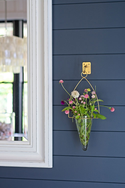
Here are a few examples of how I used the inky blue on some accent walls in our home:
ESSENTIAL DESIGN ELEMENT #2:
BOLD PATTERNS
Although I didn’t incorporate wallpaper into our farmhouse (the majority of our walls are board and batten or shiplap), I LOVE all the amazing bold-patterned wallpaper on the market these days. Holy crap – they are pretty freaking cool and so many now come in a renter-friendly peel-and-stick version.
One of my favorite sources for peel-and-stick wallpaper is Spoonflower.com. And they can also make some throw pillows made in the same, or coordinating, pattern for you! But beware – you will fall down a deep rabbit hole once you’re on their site.
This is a great way to inject some personality into your home – it really makes a room instantly look and feel posh. Not ready to bite the bullet and wallpaper an entire room? Then pick an accent wall (behind a sofa is always a great choice) and go batshit crazy with patterns.
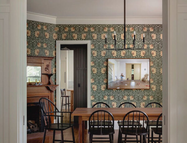
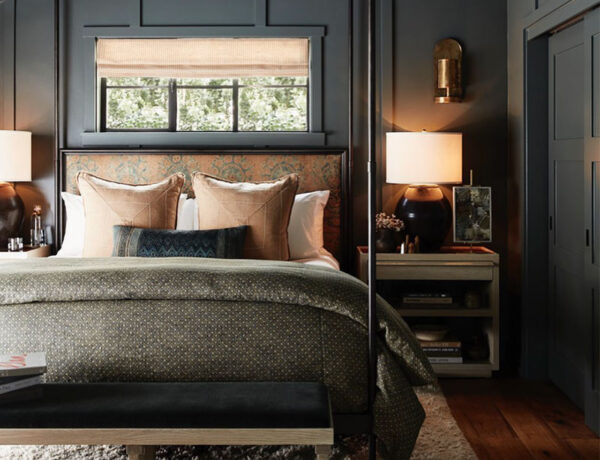
Let’s take a look at some really bold wallpaper patterns that could amp up the glam factor in your home:
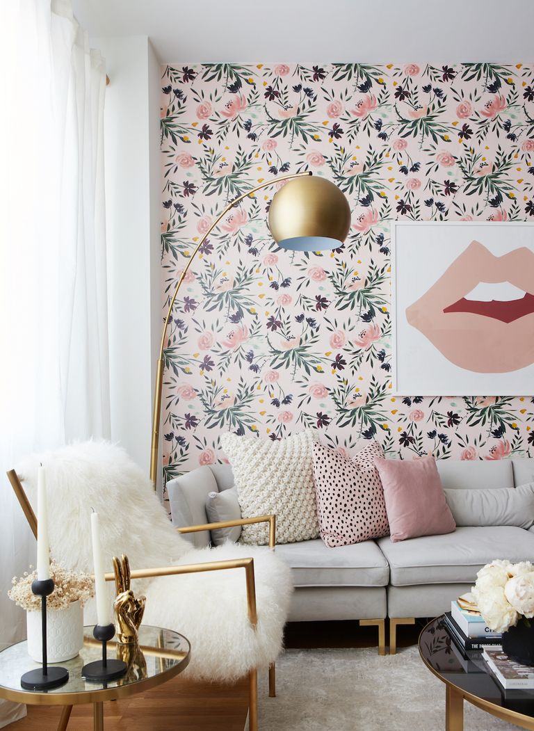 Image source: House Beautiful
 Image Source: Emily Henderson | Sara Tramp, Photographer
 Image source: Leanne Ford
 Image source: Jojo Design Studio
HOT TIP: If seeing these IN YOUR FACE wallpapered rooms are giving you an instant panic attack, don’t fret. You can easily introduce bold patterns through textiles such as curtains, pillows, bedding, and throw blankets. It’s all about taking baby steps!
ESSENTIAL DESIGN ELEMENT #3:
A CRAP TON OF SHINY THINGS
This element can be tricky to execute because there’s a fine line between glamour done right and a full-on “OMG, that’s some gaudy-ass crap!” look going on in a room. So to be on the safe side, pick something you want to highlight in a particular room and then find something shiny to help draw more attention to that area.
For example, if you have a ceiling that has beautiful detail (such as tongue and groove trim), then get a shiny, glamorous chandelier to draw the eye upward and really show that fabulous ceiling off. Is there a wall in your dining room you’d like to accent? Throw some shiny wall sconces and a glamorous mirror above a buffet and you’re good to go. See? It’s not that hard. It’s just a matter of finding balance before you find yourself treading in tacky Real Housewives-infested waters. Sorry – I call ’em like I see ’em, folks.
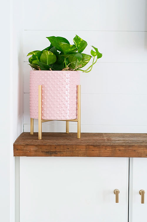
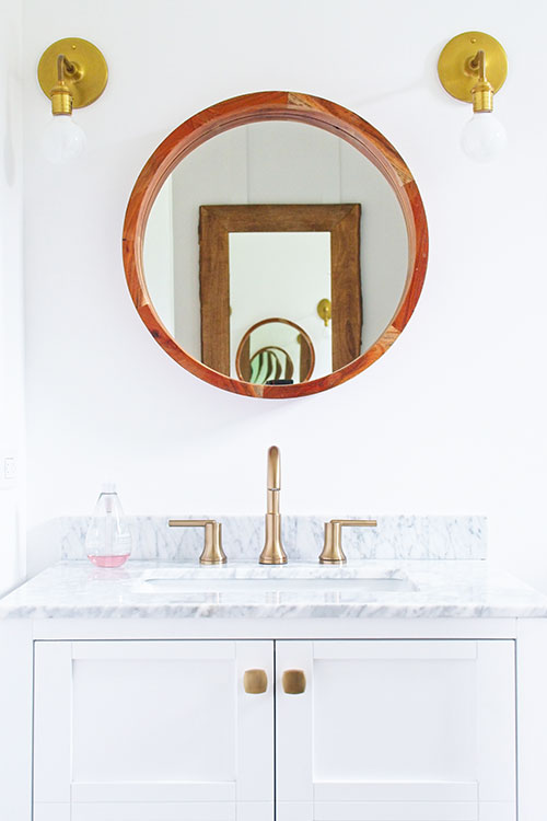
The way I introduced this element into our farmhouse was through a lot of satin brass fixtures and objects. While I’m not a fan of shiny brass, I freaking LOVE LOVE LOVE satin brass. It gives that infusion of glamorous gold without looking like those old shiny brass shower enclosures that are so dated (you know the ones …). I’d say 99% of our light fixtures are satin brass (sourced mainly from Schoolhouse Electric, West Elm, and Target), the remainder being chrome and black.
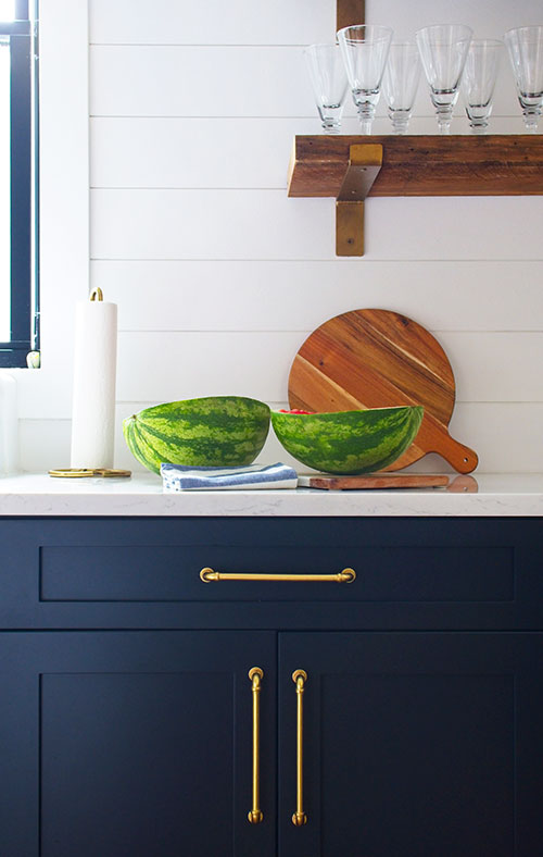
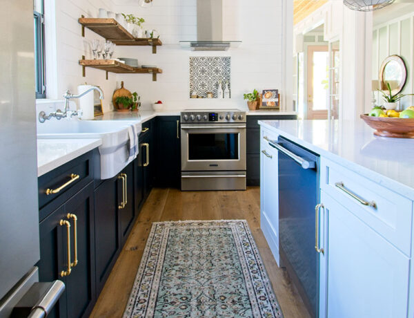
I also made sure to add little satin brass objects throughout the house as well. I took off the knobs that came with our bathroom vanities and swapped them with satin brass knobs. I also used satin brass pulls on our kitchen cabinets to add that glam factor as well as some much-needed warmth against the inky blue cabinets. I think the pulls are my favorite design element in that room and they make me grin like an idiot every time I look at them.
Here are some little ways I added glam style to our farmhouse:
Well – that wraps up my super looooong “My Design Style Defined. Well, Sort Of …” design series. I hope you enjoyed reading about all the design styles I love and how I incorporated little bits and pieces throughout our home for a fresh, modern farmhouse feel.
Thank you so much for following my blog and for letting me help you create your own lived-in, loved-in spaces!


