One of our awesome readers, Clarissa (isn’t that the loveliest name?), hit “Reply” to one of our newsletters in April this year with a request.
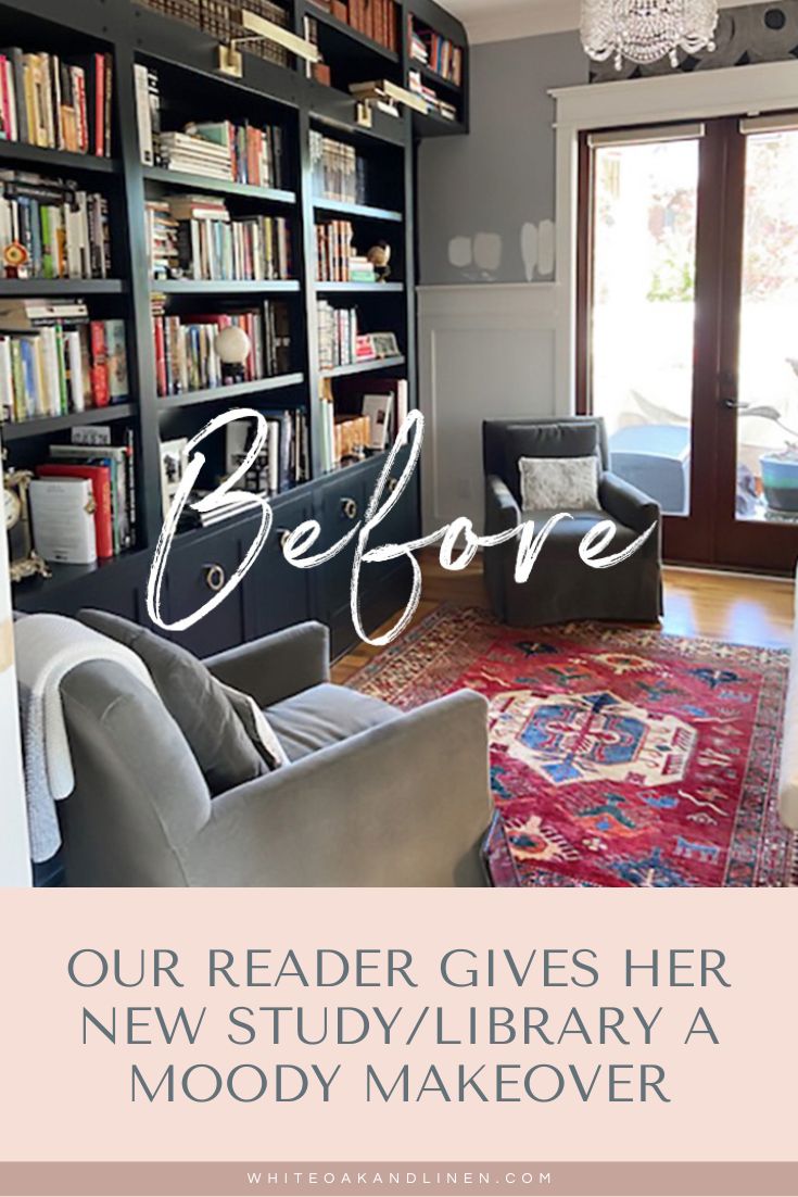
Clarissa said she was interested in getting an opinion on a room she was converting into a study/library, and that it was mainly about paint color for the trim and wainscoting in the room to help create the moodiness/vibe she wanted.
We ended up having a FaceTime meeting the following week and it was so much fun getting to know her and letting her take me on a tour of her beautiful home in Georgia. She has a really great eye for design (her friends always tell her she should be a designer and I agree!) so I was surprised she was reaching out for help.
But, I personally understand how challenging it can be to decorate your own home because you want to do ALL. THE. THINGS (um, I’m going through that right now for my own project, and my friend, Kelly, has reigned me in quite a few times already …) and sometimes, you just need a sounding board with someone who’s just as nutty about design as you in order to keep you on track with your ideas.
Here are a couple of Clarissa’s “Before” photos and you can see her paint swatches on the wall above the wainscoting in the first photo.
We talked a bit and I encouraged her to go out of her comfort zone and pull the dark color from the wallpaper for the trim, wainscoting, and ceiling to create the cozy, moody space she’s looking for and that it would also provide an interesting contrast to the very light and bright (and super fabulous!) dining room that’s adjacent to this room.
We emailed back and forth about some possible lighting and coffee table ideas for the space, and also talked about another project in her family room off the kitchen she wanted to tackle next.
Since I had just finished taking a SketchUp (a 3D modeling software program for architects and designers of all kinds) online course, I was itching to try out my new skills on a “guinea pig” in exchange for a couple of blog posts and Clarissa was game!
I can’t wait to see her family room project when it’s all done – that’s going to be such a fun blog post. I’ll share all of the 3D models I sketched for her along with paint colors and wallpaper choices and I’m sure it will get you inspired to tackle your own dark and moody project. 😍
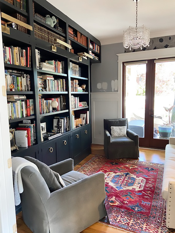
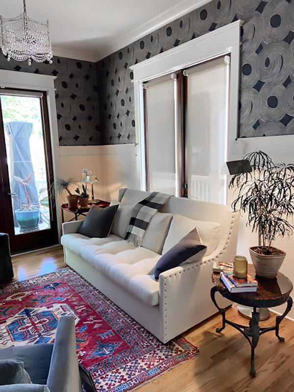
Clarissa sent me photos of her completed space in July and it’s just GORGEOUS! She was so sweet and also sent me this note: “Thank you Michelle for giving me the confidence to follow my instinct in this room, going bold made all of the difference.”
Come check out Clarissa’s new and beautiful moody study/library. Can’t you just imagine spending hours all snuggled up and reading a good book in this room? Well, done, Clarissa! 😁
I hope that this post gives you that little nudge to break out of your own decorating comfort zone (or anything in life, for that matter) and the end result will be even better than you imagined!
If you enjoyed reading this article, make sure to sign up for the weekly newsletter below so you never miss a post.
Thank you so much for following my blog and allowing me to inspire you to create your own lived-in, loved-in spaces!


