So many people want to create their own little zen-like spa bathroom but don’t know where the hell to start. It can definitely be quite overwhelming because there are literally THOUSANDS of product choices out there.
Since I actually THRIVE on seeing all of the beautiful products out there (totally crazy, right?), I thought a mood board of a serene spa bathroom design would be a perfect topic for us to tackle today.
Let’s dig in!
YOU DON’T HAVE TO GO AWAY ON VACAY
TO PASS OUT IN A PRETTY BATHROOM
There’s something so magical about going away on vacation to some spa resort and soaking your cares (and your obligatory hangover) away in a luxurious tub while listening to some relaxing tunes on Spotify.
What makes the experience even more magical is the fact that you won’t have to clean that tub afterward. Hey – it’s the little things in life.
So today, let’s channel that same luxurious, relaxing feeling into a spa-like retreat you can create in your own home, making it super easy to escape crazy-day bullshit without having to book a one-way flight.
If you’re in the early stages of planning a bathroom remodel and you’ve been looking for some fresh sources of inspiration, this post just might be the kick in the arse you need.
MY SOURCE OF INSPIRATION
Anita Yokota’s CRAZY gorgeous bathroom remodel is one I’ve been stalking and Pinning THE HELL OUT OF for months now. If you personally haven’t stumbled upon it yet, I highly recommend doing so.
I find the transformation to be incredibly inspirational: from the beautiful materials used; to the peaceful feeling the space immediately brings; to the copious amounts of daylight that floods this stunning room. WOW. Just … WOW.
To help you envision what’s going on in my tiny head, here are two different views of her amazing bathroom retreat so you can get a feeling of the room’s space and configuration.
 Image Source: Anita Yokota
 Image Source: Anita Yokota
Do you see why I’m in so much L-O-V-E with her bathroom??? It was designed SO perfectly and it’s timeless – this space won’t need to be updated in the future unless the owners grow tired of it and I can’t see that happening.
I didn’t use matte black fixtures for my design board, but I did mix metals to add some visual interest. If you’ve been afraid of mixing metals (one of my FAVE things to do!), this is a good place to start since the difference between the hardware materials isn’t totally obvious. It’s all about taking those baby steps …
The finish on the double vanity’s hardware and the pivoting mirrors is “polished nickel,” the finish on the wall sconces is “brushed nickel,” and the finish on the shower faucet, tub filler, and toilet tissue holder is “brilliance brushed nickel.”
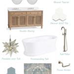
I wanted this space to make it feel like you just stepped into a resort hotel’s bathroom by incorporating soothing colors throughout all of the materials used.
Check it out!

Wall Sconces | Pivoting Mirrors | Shower Faucet | Double Vanity
Shower Wall Tile | Pendant | Tub | Tub Filler | Tissue Holder
Floor Tile | Rug for Vanity | Wall Paint Color
So what do you think of this mood board? What would you change or add to this mood board? I’d LOVE to hear your thoughts!
Thank you so much for following my blog and for letting me help you create your own lived-in, loved-in spaces!


