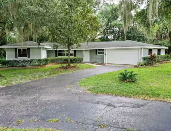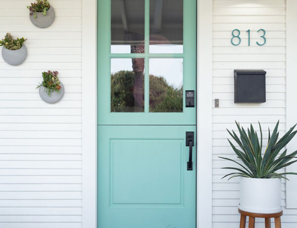
After patiently waiting since July 2022 and firing our first general contractor (GC) in early December, we’re STILL in limbo while waiting to get the new architect’s conceptual drawings for our new-old cottage project.
When I met with the new GC and his architect at the cottage in early December, I told the architect he had a blank slate to work with. So at this point, I have absolutely no idea what the floor plan is going to be or how the house is going to look.
During this (what seems like) never-ending period of limbo, I have been working on design concepts for each room and have about 80% of materials and colors picked out. Hopefully, I will only have to do minimal tweaking once I see the cottage’s new floor plan.
This week, I thought I’d share some of the inspiration behind the design for my hubby’s future home office.
Last May, he started working from home and has really enjoyed it, so my goal is to design a special space that celebrates him and all the things he loves.
I also want The Hubs to have his own “dude” space where he can freely showcase his golf trophies (he’s a really awesome golfer) and other sports memorabilia he’s collected over the years, as well as have a cozy space to just chill and read a good book.
I wasn’t sure how he’d feel about having a dark, moody space but once he saw some of these inspiration photos (his favorite is the photo below from Christopher Scott Cabinet/The Fox Group), he was totally on board.
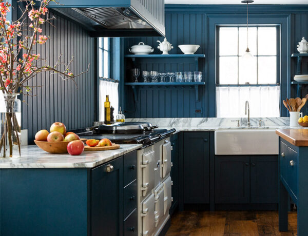
He really loves Farrow & Ball’s Hague Blue so I thought his future home office would finally be the perfect space for me to use that rich, gorgeous hue and create a truly handsome space for him.
Come check out the inspo photos below (my design notes are listed under each photo) and drop me a comment and let me know which one is your fave – I’d love to hear from you!

Note: The built-ins, especially the artwork area.

Note: The overall cozy vintage feel of this room.

Note: The overall vintage feel of the room as well as the deep hue on the built-ins.

Note: The built-in desk facing the windows, and the ceiling lights.

Note: The mixed finishes on the built-ins (wood & paint).

Note: The vintage-inspired wall mural.

Note: The lighting over the cabinetry.

Note: The sofa niche in the built-ins.

Note: The desk niche area and the picture light.
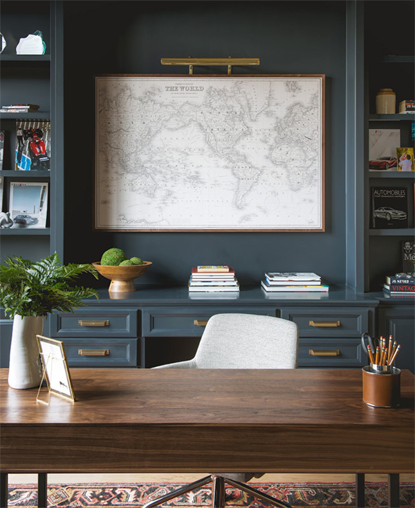
Note: The artwork niche in the built-in.

Note: The deep hue on the all the walls, cabinetry, and ceiling. The sofa.

Note: The colorful velvet armchair.

Note: The interesting textured wallpaper.

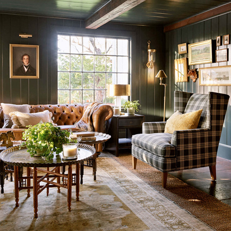
Note: The dark & cozy mood, the wall paneling, and the vintage furniture.

Note: The same dark blue hue on the wall, cabinetry, and ceiling.

Note: The mirrored tiles on the backsplash.

Note: The perfectly worn-in vintage leather chair and the floor lamp.

Note: The deep green-black hue on the walls and ceiling, and the funky ceiling light.

Note: The deep blue-gray hue on the cabinetry and ceiling, and the built-in bench.
If you enjoyed reading this article, make sure to sign up for the weekly newsletter below so you never miss a post.
Thank you so much for following my blog and allowing me to inspire you in creating your own lived-in, loved-in spaces!


