If you’re reading this post, it must mean either: A) You enjoyed reading Part 1 and Part 2 of this series or; B) You drank too much wine while reading those posts and you’re not even sure who you are or what day it is. Either way, I’m glad you’re back!
As a reminder, this is the non-sensical word we’ve been dissecting that describes my own design style:
#CALISCANDIMIDMODBOBEACHCOTFARMGLAM
We’ve already covered “CALI” and “SCANDI”, and now we’re on to “MIDMOD” which represents my next favorite design style:
MID-CENTURY MODERN (OR MCM)
The nerds at Wikipedia succinctly sum up Mid-century Modern (MCM) design as being “the design movement in interior, product, graphic design, architecture, and urban development from roughly 1933 to 1965.”
My interpretation of MCM design style is simplicity and functionality of design pieces, sleek lines, minimalistic decor (NO CLUTTER!!), and ties to nature through use of natural materials and lots of windows. You can start to see some overlap in MCM with parts of the California Casual and Scandinavian styles we covered in Parts 1 and 2.
I don’t know why, but when I think of MCM design, an image of Taye Diggs wearing some super stylish suit jacket, tailored pants, a funky shirt, stylish eyeglasses, and the perfect fedora, pops up in my brain. Is it suddenly hot in here or is it just me?? ?
ESSENTIAL DESIGN ELEMENTS:
SIMPLICITY & FUNCTIONALITY OF DESIGN PIECES, SLEEK LINES, MINIMALISTIC DECOR, NATURAL MATERIALS, LOTS OF WINDOWS, AND A PARTRIDGE IN A PEAR TREE
So for this post, I’m going to do something a little different – I’m not going to break down each essential element. The reason being, when you see photos of MCM design, all of the elements are right there IN YOUR FACE so let’s allow the photos to do what they do best.
Simplicity is a defining element for MCM design and it’s one that makes this design style so popular. The furnishings and decor are unfussy – yet functional – but they still manage to pack a real one-two punch in a room because they’re visually interesting.
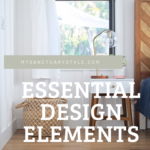
For an example of how to incorporate a taste of MCM into your own home, take a look at the nightstand I chose for our master bedroom in the photo at the top of this post. It’s a very simple, yet functional, piece of furniture (I added the brass hexagon knob for an extra “wow” factor). It incorporates the natural materials element (wood), which also adds some warmth and contrast against the crisp, white walls.
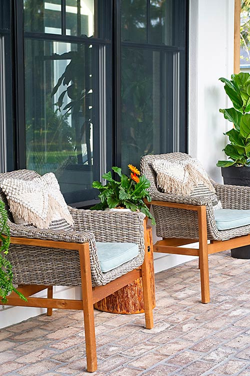
I wanted our front porch (photo below) to feel fresh and modern instead of having the expected country rocking chairs, so I brought in some MCM design through the chairs I chose for the area next to the front door.
Here are a couple of perfect examples of the simplicity and functionality of MCM design (both photos are of the same house). The bench near the landing is as simple as can be, yet absolutely stunning. I love that some foo-foo cushion isn’t covering up that gorgeous wood.
The generously large sofa is sleek and minimal in design, yet it allows the Eames Lounge Chair (an iconic piece in MCM design) to brilliantly shine. Just look at all of the glorious floor-to-ceiling windows, doing their duty of bringing the outdoors in. And that gorgeous FIDDLE. LEAF. FIG!
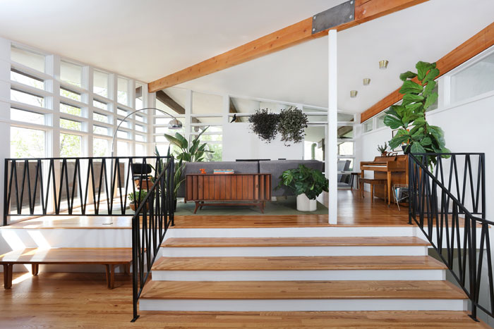 Image Source: Atomic Ranch
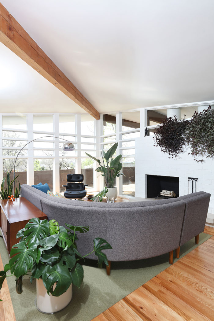 Image Source: Atomic Ranch
Emily Henderson’s (hands down, one of my all-time fave super creative interior designers) former home is a fresh take on MCM design and not a strict rendition and that’s what I love about it.
I think that if every single thing in a space is MCM, it kinda starts to feel like the room is wearing a period-piece costume and “Mad Men” characters are going to come greet me with a smoke and a cocktail. You guys can keep the ciggie but I’ll take that cocktail, please and thank you.
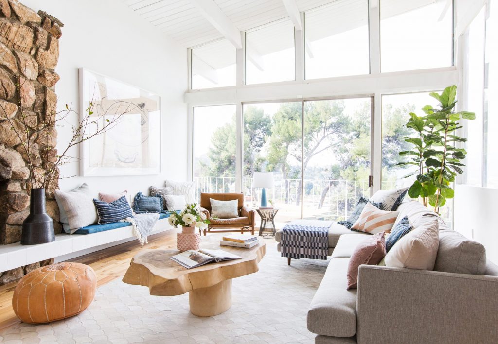 Image Source: Emily Henderson | Tessa Neustadt, Photographer
Let’s take a look at the exterior of a Mid-century modern home, and you’ll notice MCM design is equally as fabulous on the outside. Is this thing a piece of art or WHAT?? When you see something like this while scrolling through Zillow, it just stops you dead in your tracks.
There is no ubiquitous cookie-cutter feeling like the homes of today – each MCM home is so unique in its architectural design. It’s no wonder why these stunning homes continue to stand the test of time.
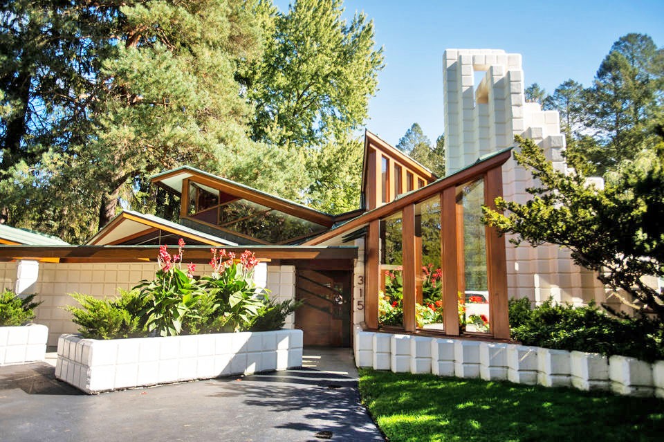 Image Source: Atomic Ranch | Kaytie Boomer, Photojournalist
And lastly, let’s take a look at a few examples of some stylish MCM-style pieces you can incorporate into your own home. If you’re feeling really adventurous and want some pops of color, Joybird has TONS of different fabrics for their furniture.
They will even send you THE cutest little swatch kit ever. I still have mine somewhere – I can’t get myself to part with the damned thing.
Joybird Eliot Sectional with Bumpers
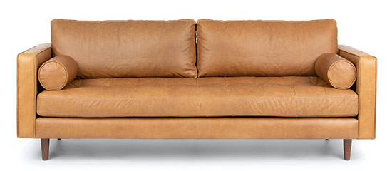
Article Sven Leather Sofa
AllModern Orlie Coffee Table
 Joybird Soto Leather Chair
I hope you enjoyed Part 3 of this series and you’ll keep coming back for more. In the meantime, let that tasty image of MCM Taye Diggs marinate in your brain …
Thank you so much for following my blog and for letting me help you create your own lived-in, loved-in spaces!


