Today, we will dive into the second part of my 7-part “My Design Style Defined. Well, Sort Of …” series.
As a refresher from my last post, this is the word diarrhea I managed to come up with to describe my personal design style:
#CALISCANDIMIDMODBOBEACHCOTFARMGLAM
As another refresher from the last post, you learned that the “CALI” part is for “California Casual” design style. For today’s post, let’s dissect this diarrhea (ew …) and go to the next part – “SCANDI” which stands for my next favorite design style:
SCANDINAVIAN (OR SCANDI)
Wikipedia defines Scandinavian design style as “a design movement characterized by simplicity, minimalism and functionality that emerged in the early 20th century, and which flourished in the 1950s, in the five Nordic countries of Denmark, Finland, Iceland, Norway and Sweden.”
My interpretation of Scandinavian style is a minimalist, yet functional, space adorned by textured and natural elements to lend warmth to the space. There’s a little bit of an overlap with California Casual style with regard to introducing natural elements. It’s this natural element component that gives Scandi style the warmth it needs since this style uses neutral colors (like white, grey and tan) and it’s very easy for a space to feel cold and sterile.
I’m going to give you a mental image that best summarizes my interpretation of Scandinavian style in human form: Chris Hemsworth (functional & natural) wearing nothing but grey boxer briefs (minimalist) and fluffy white socks (textured). You’re welcome.
 ESSENTIAL DESIGN ELEMENT #1:
MINIMALISM (NO CLUTTER!!)
Have you ever been to someone’s house that has a shit ton of tchotchkes everywhere or bad wall art covering every last inch of wall space and you instantly feel like you need to run out of their house because it’s overwhelming all of your senses? Yeah – do the opposite.
Scandi style embraces lots of negative (blank) space so your eyes can rest which then causes the remainder of your body to feel relaxed. We don’t want our homes to trigger the fight-or-flight responses of our family members or guests, so embrace the fact that negative space is our friend.
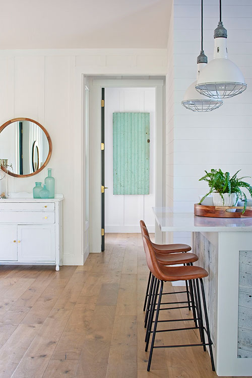
The photo below is the view from our dining room looking towards the short hallway to the master bedroom suite. Note that there is ample negative space throughout the room so your eyes just focus on interesting elements: the gorgeous oak floors, the wooden round mirror, the vintage pendant lights, the small sea glass bottle collection and the antique aqua door from Cape Cod (a $50 find!).
This is one of the first views our guest see when they walk into our home and I don’t want them to be bombarded with “HEY, YO – LOOK AT ME!!! NO, OVER HERE – LOOK AT MEEEE!!” due to visual clutter scattered everywhere.
The photo below is another great example of how you can still make a visual impact in a minimalistic space. I love how nothing at all is hanging on the brick walls (a texture element) which makes your eyes go straight to that FABULOUSLY HUGE PENDANT which steals the show. And I love how the dining table is naked – no floral arrangement or fruit bowl necessary.
That table is gorgeous all on its own and again, it makes your eyes go right to the FABULOUSLY HUGE PENDANT. There aren’t any elements in this room that are fighting each other for stage time – they all work together harmoniously. This is minimalism done perfectly.
 Image Source: Unknown – found on Pinterest
 ESSENTIAL DESIGN ELEMENT #2:
FORM & FUNCTION
What I really love about Scandi style is the use of items that provide both form and function. You really don’t need any foo-foo design elements with Scandi style and that’s what makes it so aesthetically pleasing to the eyes.
A great resource for Scandinavian design items (and one of my Top 3 fave stores ever) is IKEA. Now, some of their stuff can be pure crap, but they also have a lot of gems. And if you haven’t ever heard of an IKEA hack, my God – that needs to be your next Google search. I promise you – you’ll be stuck in a rabbit hole for hours!
Here are a few items from IKEA that check off both the form AND function boxes. They’re simple in design, yet so visually interesting that they make you actually want to use them on a daily basis.
 IKEA BEKANT Storage Unit with Smart Lock
 IKEA SINNERLIG Bamboo Pendant Lamp
 IKEA STOCKSUND Armchair (I have this in a different color and it’s my fave chair ever!)
 ESSENTIAL DESIGN ELEMENT #3:
NATURAL AND TEXTURED MATERIALS
We’ve already covered the natural element in Part 1 of this series: those natural elements being wood, stone, etc. Now, textured elements could be found through a few things: could be found on walls (wood, brick, etc.), could be on wood flooring (rustic detail) or could be through textile materials.
Now remember, Scandinavian design originated in the Nordic region of the world and these people aren’t walking around outside in bathing suits. It can get cold and dreary in those countries so bringing in feelings of warmth and coziness is essential to this style. So to help achieve much-needed warmth & coziness vibes, they rely upon natural (like linen and cotton) and textured (think chunky knit throws) textiles.
Below is a perfect example of the simple beauty, warmth and coziness of Scandi style (and it should be – the homeowner lives in Sweden!). I encourage you to visit her blog and spend hours looking through all of her gorgeous photos.
Look at all of the natural elements – the wood flooring, the wood staircase leading to what I can only assume is Scandi Heaven, the linen sofa, the wood photo frames, that gorgeous wood coffee table. And then all the texture as well – that fabulously cozy area rug, the linen throw pillows, that chunky throw blanket. PERFECTION. ?
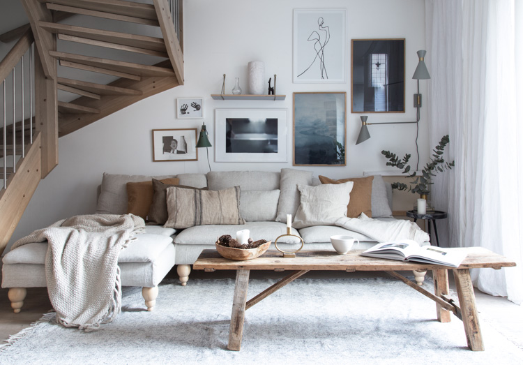 Image Source: My Scandinavian Home
And look at this gorgeous bedroom below – it has to be one of the coziest bedrooms I’ve ever seen!
I’d hibernate in this thing for at least 3 months (can a human survive on Netflix and chocolate alone?). It’s so beautifully designed – look at all of that gorgeous texture everywhere. MORE PERFECTION. ?
 Image Source: Interior Design by Tiffany
 I bet you now have a bettering understanding as to why I’m so madly in love with the perfectly imperfect style of Scandinavian design. Its simple beauty and warmth instantly wash a feeling of peace and serenity over me.
If you enjoyed reading this article, please subscribe to Sanctuary’s weekly newsletter so you never miss another post. The signup box is conveniently located below.
Thank you so much for following my blog and for letting me help make your life + home a little more beautiful, simple, and serene! XOXO ❤︎


