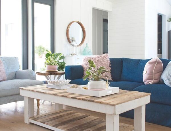
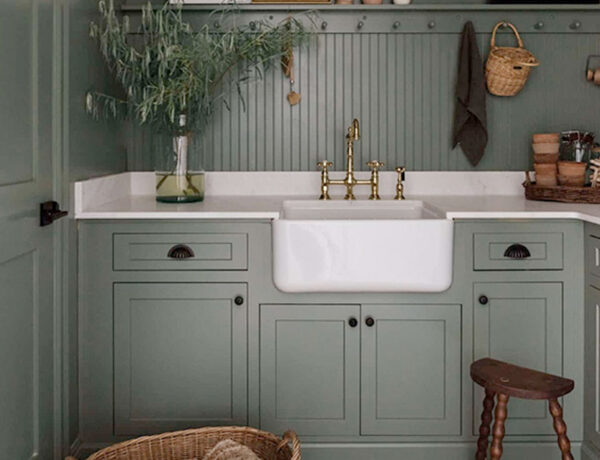
Last year, when I was discussing my vision for Sanctuary with The Hubs, he asked me what my design style actually is since it can’t really be nailed into one category. So here’s what I came up with to best describe my current design style:
#CALISCANDIMIDMODBOBEACHCOTFARMGLAM
I know what you’re thinking – “Michelle, WTF is this word diarrhea you just crapped out?” Sure, I could use “eclectic” as a style but what fun would THAT be? Plus, it’s so much easier to say than #caliscandimidmodbobeachcotfarmglam and I really enjoy making people squirm.
Instead, I’m going to give you my interpretation of the 7 different design styles that turn me on instead of using “eclectic” which can be interpreted in SO many ways, not all of them being positive.
Does “eclectic” mean you just inherited crappy hand-me-down furniture and accessories from your eccentric Aunt Mitzi and are slapping them together to see what sticks? See where I’m going with this?
Eclectic style done right might seem like someone is throwing random things together and hoping for the best, but it really isn’t. There’s quite a bit of thought that goes into designing something interesting with “random” things.
So let’s dive into the first part in a series of 7 and get started with my first favorite design style:
CALIFORNIA CASUAL
My interpretation of California Casual style is TONS of natural light, white walls or ceilings that are anything but boring, lots of natural elements, and an effortlessly cool vibe.
It’s kinda like when you compliment a woman for a pretty white flowy dress she’s wearing and she replies coyly with, “Oh THIS old thing? I just threw it on …”, which instantly makes you want to slap her in the face because she looks so damned effortless.
Yeah, so that’s my interpretation of California Casual design.
ESSENTIAL DESIGN ELEMENT #1:
WHITE UN-BORING WALLS OR CEILINGS
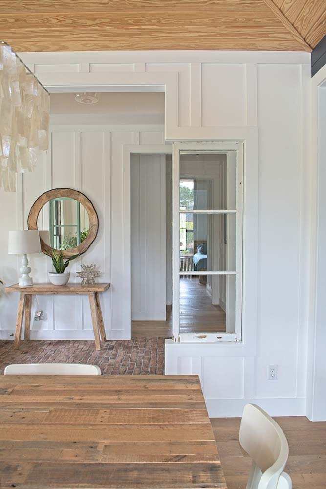
I incorporated some California Casual style into our new farmhouse by using white board-and-batten or shiplap walls to add some texture to keep each room from feeling sterile. A perfect example is in the photo above of our foyer. I wanted to set the tone as soon as guests stepped into our home.
I wanted them to immediately feel relaxed and comfortable without me having to hand them a cocktail with a goofy tiny umbrella in it in order to do so. Although, I’m sure they’d appreciate that gesture as well.
Another cool thing about walls with textured elements is the play of shadows that occurs from various sources of light throughout the day. It’s a constant visual dance that adds depth and additional interest to the walls.
Here are a couple of examples of amazingly un-boring wall and ceiling design ideas that epitomize California Casual style:
 Image Source: Sarah Sherman Samuel
 Image Source: Amber Interiors Design Studio | Tessa Neustadt, photographer
ESSENTIAL DESIGN ELEMENT #2:
NATURAL MATERIALS
Using natural materials throughout the home is what helps lend that effortlessly cool vibe that screams, “I DON’T CARE WHAT YOU DO TO ME, I’M STILL GOING TO LOOK FABULOUS. SO SUCK IT.”
I incorporated a lot of natural elements throughout our farmhouse, mainly through using 3 different kinds of flooring materials: French white oak wood floors, brick floors, and tumbled marble floors.
Below is a photo of our dining room looking out to the foyer, which then leads to a hallway to our guest room. You can see quite a few natural materials being used in these spaces: brick flooring, wood flooring, pine tongue-and-groove (or T&G for short) ceiling, the round wooden mirror, the wooden entry table, the reclaimed wood dining table, and the capiz shell chandelier.
In addition to the beautiful aesthetic of the brick floor, it also serves a very important purpose. It helps catch all the dirt and grime, brought in by our three rescue dogs as well as visitors before those dirty feet hit the gorgeous oak floors.
The brick floor is surprisingly easy to clean – occasional vacuuming and a monthly swipe of a steam cleaner – but it does need to be sealed at least once a year. So while it’s not maintenance-free, it’s pretty damned close.
For our next home, I’m DYING to use stone floors such as the amazingly talented Leanne Ford used in this charmingly sweet cabin below.
Plus, look at all of the beautiful textured walls and ceilings!! Gah! Pinch me – I’m pretty sure this is what Heaven looks like.
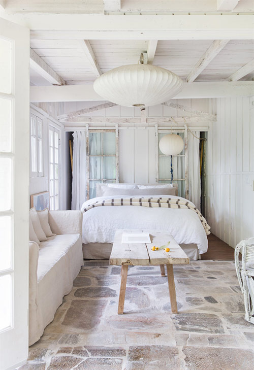 Image Source: Leanne Ford
ESSENTIAL DESIGN ELEMENT #3:
TONS OF NATURAL LIGHT
When I designed our modern farmhouse back in 2016, I knew I wanted every room to be flooded with natural light. I guess it’s the photographer in me or the simple fact that I don’t care to live in a dungeon, but that was a non-negotiable Wish List item for me.
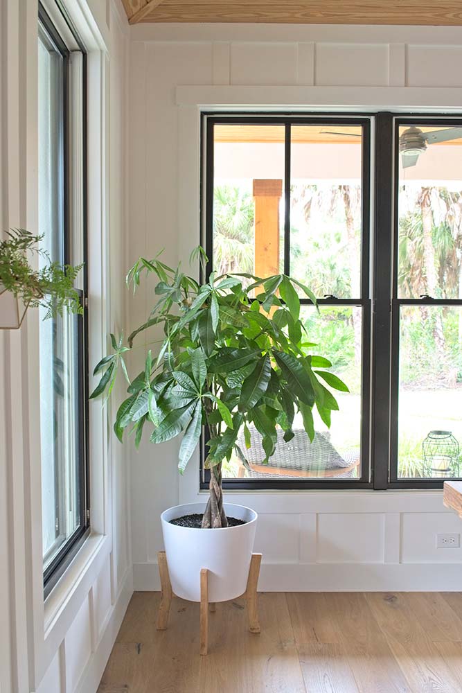
I designed our farmhouse using HUGE floor-to-ceiling black windows to fill our home with natural light as well as add some much-needed contrast against the stark white walls.
I told The Hubs during the planning stages that if anything needed to be taken out of the construction project due to budgetary constraints, it wouldn’t be the windows – OVER MY DEAD BODY. They were going to be the crowning glory of our farmhouse and DAMMIT, did they deliver.
I mean, c’mon. Look at these babies doing their thing in our dining room. I had to cut out a lot of budgetary items to keep my windows but it was SO worth it!
Here are a few perfect examples of serene spaces that get TONS of natural light:
 Image Source: Kate Zimmerman Turpin
 Image Source: Amber Interiors Design Studio | Tessa Neustadt, photographer
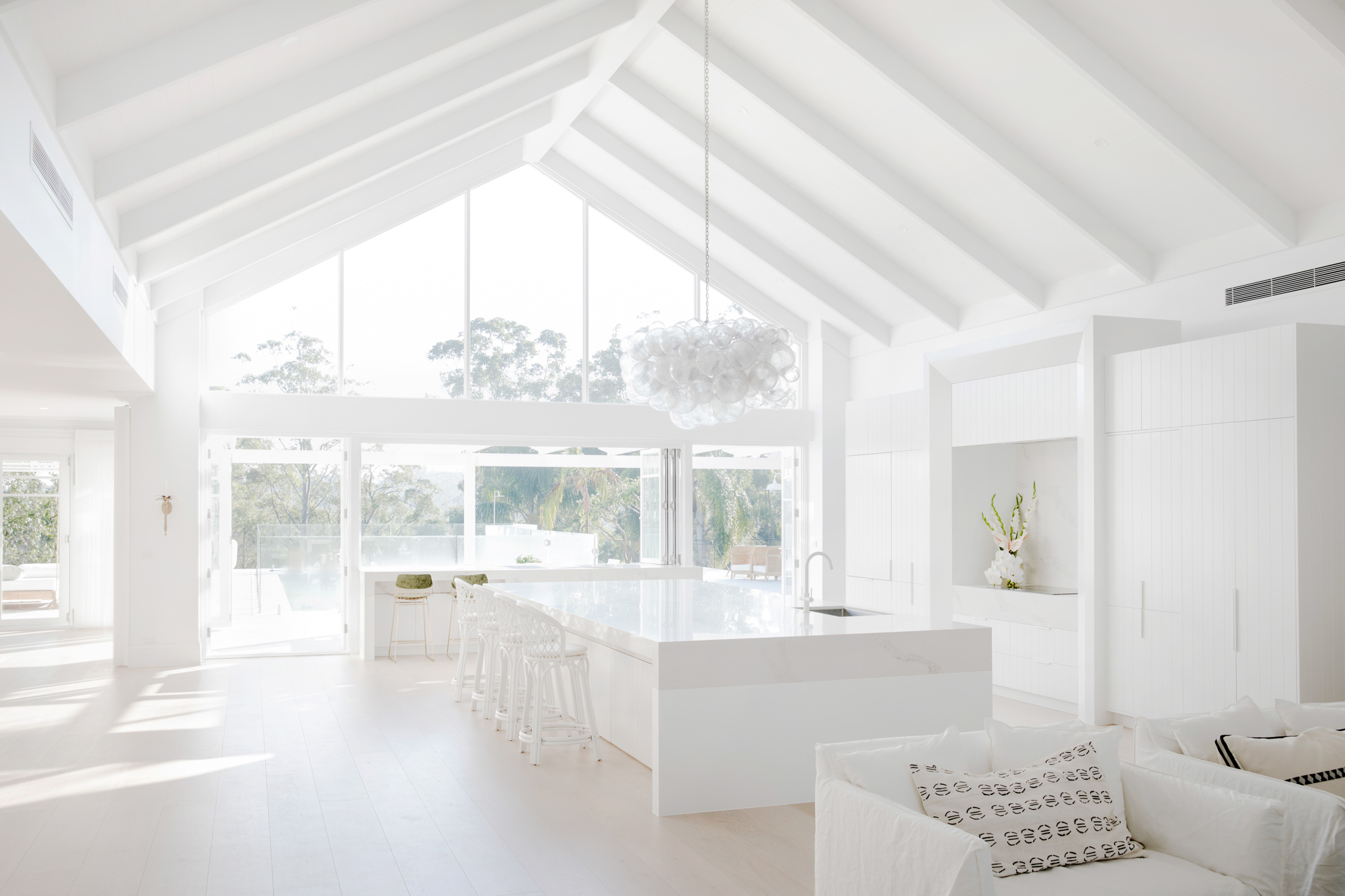 Image Source: Three Birds Renovations
I think you get the idea of California Casual design style and why I’m such a HUGE fan of it. It’s so perfectly effortless, I want to slap it right in its beautiful face.
Thank you so much for following my blog and for letting me help you create your own lived-in, loved-in spaces!


