Welcome to this edition of “Color Me Happy – How to Create Your Home’s Perfect Color Palette!”
If you didn’t read the Mykonos edition, click here to check out the super relaxing color palette I created using a photo of a Greek villa as my inspiration. You can also find more Color Me Happy editions here and if you want to read about my exact step-by-step process, make sure to start here.
With Fall quickly approaching, I thought I’d create a palette using some bold, yet warm, colors that would make it feel like your home wants to envelop you in a GIANT hug (which isn’t such a bad thing) because of the level of comfort these colors bring.
THIS EDITION’S INSPIRATION:
THE LEGENDARY DEVOL KITCHENS
When I was designing our farmhouse back in 2016, I would scroll endlessly through Instagram for inspiration and happened upon all of these GORGEOUS kitchens I ended up bookmarking. I quickly realized these kitchens all had one common thread – they were designed by deVOL Kitchens in England (they now have a stateside showroom in New York – YIPPEEEE!!!).
Ever since they cast their enchanting spell on me, I’ve been in L-O-V-E with pretty much everything they do. They are true masters at their craft and in my eyes, aren’t capable of doing any wrong when it comes to designing simple – yet delightfully magical – kitchens.
I have their brochure (which is actually a book) and I can’t even begin to put into words how much I love every page in that thing. And I’ve watched every video on their website multiple times – they’re like mini-movies that were beautifully produced and directed. No surprise there.
So for this edition, I thought I’d use one of their fetching projects as inspiration for my mood boards. And in this edition, I designed not one, but TWO rooms based upon the color palette I created from my inspiration photos!
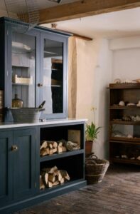
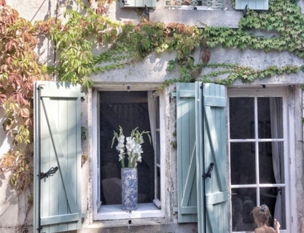
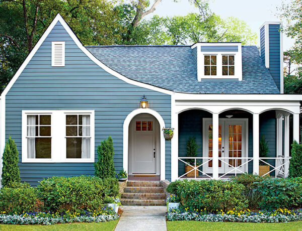
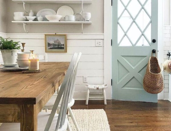
THE INSPIRATION PHOTOS FOR MY PALETTE
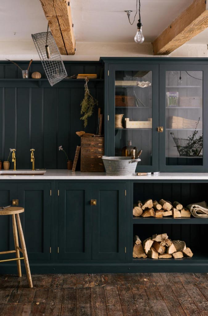 Image Source: deVOL Kitchens
 Image Source: deVOL Kitchens
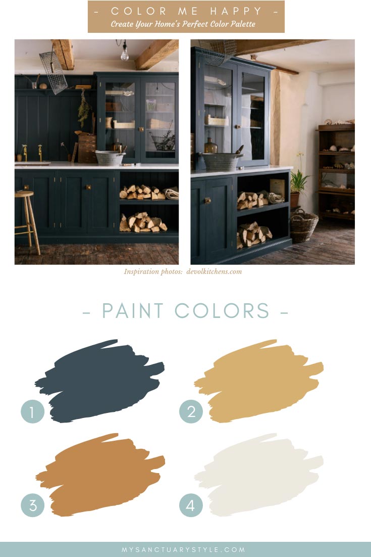
1. Hague Blue | 2. Hathaway Gold | 3. Toffee Tart | 4. Alabaster
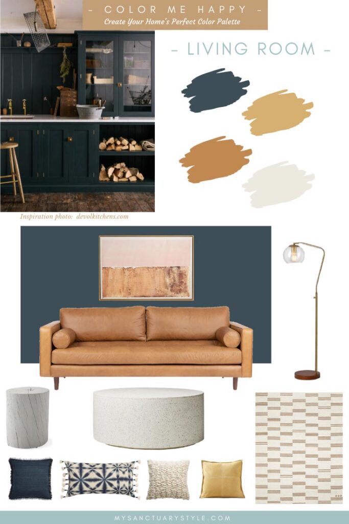
Wall Color | Sofa | Wall Art | Floor Lamp
Side Table | Coffee Table | Area Rug
Blue Pillow | Graphic Pillow | Ivory Pillow | Gold Pillow
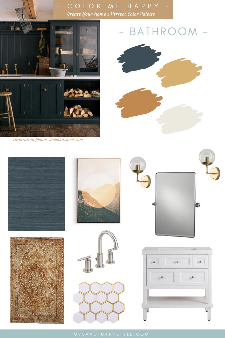
Grasscloth Wallpaper | Area Rug | Canvas Art | Faucet
Brass Inlay Floor Tile | Vanity | Mirror | Wall Sconces
What were YOUR favorite design elements from any of these mood boards? I would love to know!
These mood boards are just basic starting points, but you can always get more creative with the color combinations by using the palette as your guide.
Just remember this: Decorating is and should be fun – it shouldn’t stress you out. If it does, somethin’ ain’t right …
Thank you so much for following my blog and for letting me help you create your own lived-in, loved-in spaces!